Iconography is everywhere. From signage and wayfinding, to websites and packaging, and, of course, in great presentations. Icons represent a universal language easily understood at a glance, regardless of native tongue. We believe that incorporating simple visuals with clear content speaks volumes. Content is more digestible and comprehendible with icons, elevating the overall look and feel of the design. There is, however, a right and wrong way to do this. Let’s dive in.
Message
Understanding what you’re communicating is arguably the most important determinant to choosing an icon. An icon that misses the mark can lead the viewers’ understanding of the content in the wrong direction. Knowing the types of iconography available will help you know what kind of context to provide your audience. Pictograms and Ideograms are two choices.
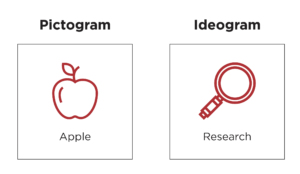
Pictograms are a literal interpretation of the content, such as an icon of a piece of baggage to represent “baggage claim” at the airport.
Ideograms are symbols that take a more conceptual approach representing the idea. Viewers must learn to understand ideograms, like choosing an icon of a rocket ship to represent a product “launch”.
Style
Choosing an icon style for a design is very similar to choosing typography. A good rule of thumb is to aim for a single color icon design. This is not a hard and fast rule, as icons can be more detailed, however this often leans more toward illustration than iconography.
In a single color design, it’s important to decide if the shapes will be filled or outlined. Either choice is fine, but the key is consistency throughout the design.
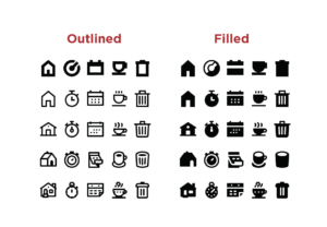
When some icons are filled and others outlined, the overall design looks careless and haphazard vs. intentional and well thought-out.
It’s also important for icons to appear as if they were “drawn by the same hand” visually. Simply put, each icon must have a similar amount of detail and weight. This can be tricky, but is paramount for design consistency throughout the project.
Scale
You don’t want icons to compete with each other. Above all, they shouldn’t compete with the content they represent. Adopting a “less is more” philosophy for iconography is key here. While it’s tempting to have an icon be large and commanding, heavy icons are very easily overbearing. Icons should be designed to work at a very small scale without concern for missing details. Again, this is very similar to a typographic layout. Here are some examples that show appropriate use of scale with icons:


If you are intentional about your iconography–considering messaging, style and scale: you’re on the right track! Let us know what you’ve learned and your favorite tips and tricks when it comes to utilizing icons in design. We’d love to partner with you on your next project and figure out how icons can support your messaging to keep your slides clean and impactful. Reach out today for a free quote!
