Do you get my gist?
It’s a common phrase that means, “do you understand me?” or “do you get me?” It comes from the world of visual cognition. Scene gist is a fancy of way of talking about how we understand what we see.
We’ve compiled some recent studies about how the human brain creates meaning through what we see. Specifically, we’ll look at how shape and color work to help or hurt our visual understanding. Then we’ll talk about how this research can guide our design and presentation media choices. If you are someone who creates, uses, or views presentations with visual media, then we think you’ll find this fascinating.
Shape & Color
When you see an image, it only takes you a fraction of a second to identify its “gist.” In other words, to classify it for meaning. In fact, research from Kansas State University’s Visual Cognition Laboratory shows that after just 36 milliseconds viewers can classify as scene as a home or a beach or a city or a forest. And they are right over 80% of the time.
But what happens if you change the shape or color of something familiar? What if you get creative with your filters or photo editing programs and change the natural colors of the forest to something unnatural?
According to research by Monica S. Castelhano and John M. Henderson, in order to understand a picture, our brain takes visual input from different channels. For example, shape and color. If the picture is clear, we can change the color and it will only cause a slight delay on how quickly we figure out the picture’s gist. For example, we can still identify picture B as an outdoor walkway even though the picture is black and white.
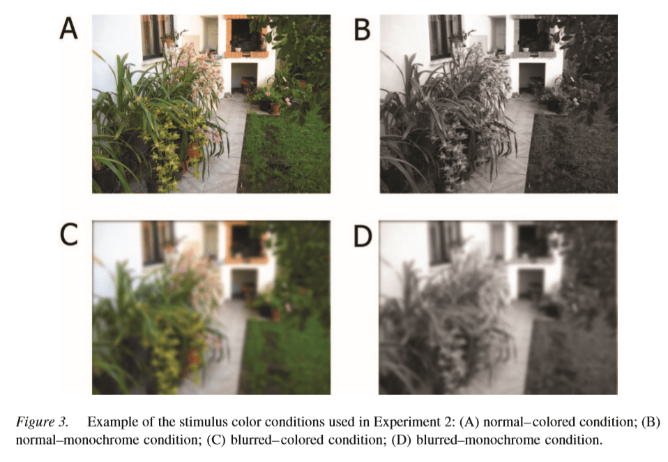
That’s because the shapes in the picture are still crisp. However, when the shapes in the picture are blurred, as in C and D, we rely more heavily on the color to give us clues to help us understand picture.
Why Does This Matter?
When designing presentation media or marketing materials, it helps us to remember that color and shape work together to help us process meaning. Our brains take in visual information from different channels, and if one channel is lacking, the other has to work harder to provide the information we need.
For example, if your logo or picture is quite abstract, the colors you use will be more important. Want to make a logo with an apple that looks more square than round? Fine. But that means you might need to rely on the color red to help communicate that it’s an apple. On the other hand, as long as your shapes are clear, you can feel free to experiment more widely with your color choice. So with that same logo, if it’s the familiar, rounded shape of an apple, you can use a wider variety of colors without risking that your audience might misunderstand or misinterpret the image.
So do you get our gist? Shape and color work together on different but related channels to help us understand what we see. Once you know how they influence each other, you can make sure your design decisions don’t negatively affect your audience’s ability to understand the gist you are trying to communicate.
We love developing, designing, and delivering presentations from a foundation of scientific research. Want to learn more about our resources and how we can help you with all of your presentation needs?
