You might not give your font much thought when you are typing up a report or sending an email. But when you are presenting, your words are displayed on a large screen and listeners spend time staring at those large letters.
That means you should pick your font the same way you pick your clothes on presentation day, with considerable thought. Here are 4 things to consider.
Font is Communicative
When it comes to choosing a font, look for something that reinforces the meaning of the message, not something that simply looks nice. According to Practical Typography by Harvard graduate Matthew Butterick, typography is a utilitarian art. But it’s more about your communication sensibilities than your design taste. While aesthetics does play a role, that shouldn’t be the main thing guiding your font choice. Butterick uses the following example of road signs.
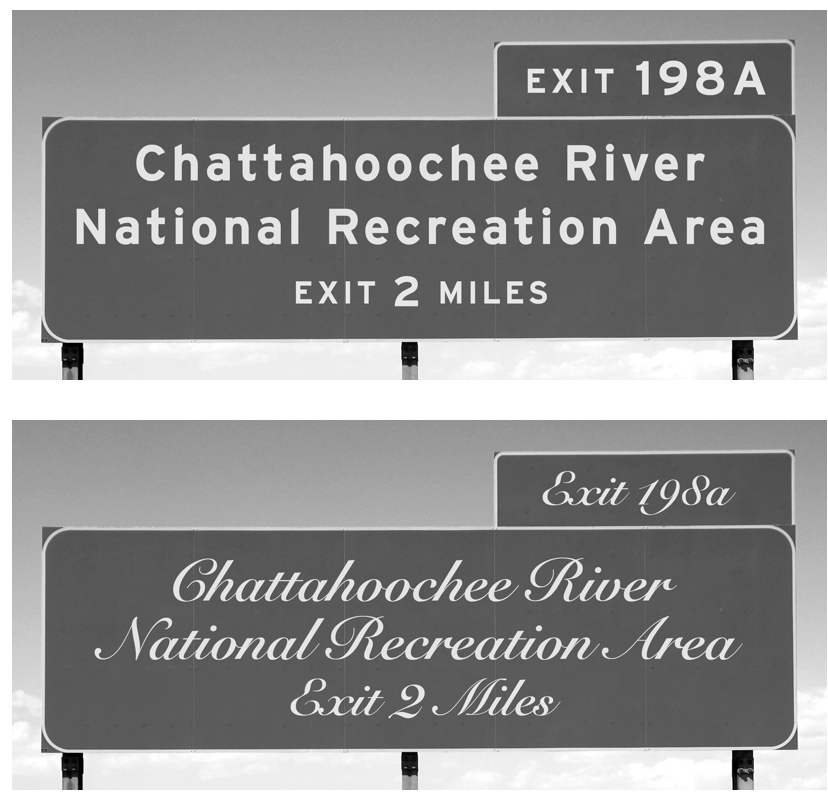
While the script font in the second picture might be more aesthetically pleasing (“prettier”) in some cases, it actually runs counter to the purpose of this message, which is to get information to drivers quickly and clearly from a distance. The same is true for your presentations. Pick a font that aids you in delivering your message to your audience.
Font Can Affect Mood
A study by Kevin Larson and Rosalind Picard found that typography can affect the mood of readers. And it doesn’t just make them happier, it makes the time seem to pass more quickly. This finding alludes to the old adage, time flies when you are having fun. If the font that you choose for your presentation is attractive, clear, and engaging, your listeners will literally enjoy themselves more.
The same research also noted an interesting correlation. When participants were asked to process information with poor typography (a bad font choice), they felt out of control, but they didn’t score much lower on comprehension. In other words, a poor font choice doesn’t necessarily mean your audience will understand less. But it is tied to aesthetic preference which affects emotional responses and perceptions.
Font Needs to be Consistent
Some presenters think that changing the font often will present the variety that audience members crave. While it’s true that we need variety in many forms in our presentation (content type, vocal pitch, movement, etc.), that rule shouldn’t apply to design. When it comes to font choice, keep it simple. Use the mantra, less is more.
Also, keep in mind that your font is part of creating your brand. Famous brands like Coca-Cola and Disney have recognizable, trademarked fonts. When picking a font, choose something that is both distinct from other companies and also consistent with your brand image and the message you are conveying.
Font Needs to be Clear
Above all, your font should be readable. One common piece of advice is to reserve all caps for headlines or smaller lines of limited font. But why? According to Butterick’s Practical Typography, “Cognitive research has suggested that the shapes of lowercase letters—some tall (dhkl), some short (aens), some descending (gypq)—create a varied visual contour that helps our brain recognize words. Capitalization homogenizes these shapes, leaving a rectangular contour.” In other words, our eyes have to work harder to distinguish letters, and therefore meaning, when they are all similar in shape and size.
In addition, pay attention to the space created between letters, words, and lines. Does it make your message easier to read? And keep in mind that the clarity and quality of your printed text might be very different on a laptop versus on the big screen in an auditorium. View your font in the size you’ll be presenting it in before making your final selection.
All elements of your presentation are part of communicating your message. Your job as a speaker is to control what they are saying. These 4 considerations about font choice will help you elevate your presentation design and your message clarity.
If the thought of designing presentation graphics or even picking a font overwhelms you, don’t worry. At Ethos3 we have a talented team of designers who know the ins and outs of typography. Help is just a click away.
