This past weekend I sat through a presentation that was jam packed with information. I was desperately scribbling notes as I worked to keep up with the presenter. Glancing back and forth between my notes and the screen I felt my eyes beginning to get tired, when all of a sudden it dawned on me why. The font the presenter was using was the absolute wrong font to show on a screen.
Thinking about the type of font to be used in a presentation may seem like a tiny detail but the reality is that it can make or break whether your slides help or hurt your overall presentation. But today we aren’t going to get into the nuts and bolts on which specific font to use instead we are going to look at whether you should use a Serif or Sans Serif font in your next presentation.
In order to make the right decision for your next presentation you have to start by understanding the difference between these two styles of fonts.
Simply put a Serif fonts is any font that has a small line attached to the end stroke in a letter or symbol. If you want to see a blatant serif font just go look at Times New Romans this font is the most obvious representation of this style.
As for Sans Serif fonts it is the same type of font as a Serif font but without the small line attached to the end stroke, a great example of a Sans Serif font is Arial. This style of font is most prevalent on digital displays, as lower resolution can sometimes make the small details of a serif font difficult to read.
So, when it comes to your next presentation deck which style is best. Well that depends on what medium your deck will presented in. As stated earlier if your deck is going to be displayed in a digital medium it is best to use a Sans Serif font. This will help your audience stay connected rather than create a distraction of tired eyes as they try to make out the small details of your font.
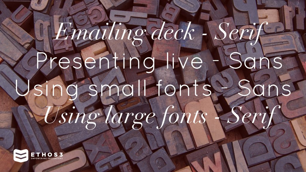
However, if you are going to be printing your deck and giving it to your audience in hard copy form it may be best to use a Serif font. The reason being that according to a study done by Daniel Oppenheimer a professor of psychology at Carnegie Mellon University, fonts that are more difficult to read in print actually increase information retention. Which means unless you are willing to bust out some word art an easy way to slow down readers and increase retention is by adding those tiny lines also known as a Serif.
Choosing the best font for your next presentation may seem small but it can make all the difference. Choose correctly and you can leverage your visuals to help increase retention and engagement, choose incorrectly and you may end up with an audience like me, eyes exhausted and counting down the minutes until the presentation ends.
If you would like some help designing your next presentation be sure to reach out to the Ethos3 team at ethos3.com/presentation-design we would love to help you with your next presentation.
