Storytelling is the crux of any presentation because it’s the easiest and most effective way to keep your audience compelled and engaged. In fact, research found on the Harvard Business Review, suggests storytelling not only improves our focus, but it also helps us retain information and compels us to change. However, the data you use to inform and illustrate your story is just as important as the narrative itself since data is what provides a story with invaluable context and legitimacy.
That said, it can be tough to figure out how to make the two work together effectively. After all, when you think of what makes a particularly compelling story, your first thought probably isn’t “why, all that data of course!”
Data on its own tends to be dry and boring. But when you know how to transform that data into a killer story, it’s nothing short of fascinating.
Find Your Primary Story
One of the great things about data in general is that any given set can be interpreted in infinite ways and tell any number of stories. But when tasked with a presentation, your best bet is to find one pointed story within the data and build out from there. To find it, ask yourself questions like: Who are the main players? What are the conflicts? What future outcomes does this information suggest? and What will my audience take from that information?
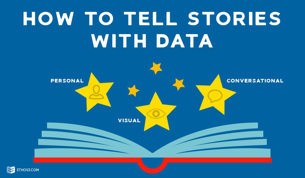
Make it Personal
Facts and figures don’t resonate with the human spirit; feelings and common ground do. If you want your audience to connect with the message your data is sending, then you’ll want to make it personal. That means peppering your presentation with personal anecdotes, relatable metaphors, and qualitative examples that folks can use to make references to their own lives.
Give Love to Your Visuals
When it comes to helping your audience understand and feel compelled by your data, little is more important than your visuals. Employ graphs, infographics, and charts to help you simplify complex concepts and make them easily digestible for your audience. You also want to be sure that those tools are aesthetically appealing—it’s kind of amazing what bright colors, bold text, and animations can do to ensure your viewers receive and digest the message you’re sending.
Dialogue with Your Data
Just because your presentation is data-infused doesn’t mean it shouldn’t involve interfacing with your audience; quite the opposite, in fact. Taking care to include questions, highlight the unique needs of the audience, and solicit thoughts and insight throughout your presentation will instantly make your audience feel more connected to what you’re saying. The more connected they feel, the better they understand and the more deeply your message will resonate.
Know Your Audience
Nearly any given dataset can tell a super simple story or a highly complex story, depending where you put your focus and what you choose to highlight. Developing a keen awareness of who your audience is in terms of their background, education, and experience with your particular topic will allow you to figure out just how much you can say—and how to say it—so that your audience will understand it.
