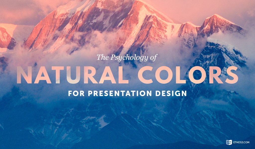
Colors in presentation design carry psychological implications. Choice of color tones and pallets can impact the way your message is received by your audience. If you are learning towards natural colors for your presentation design, there are subliminal messages that you need to be aware of for your audience.
Cognitive Effects
Nature has a natural way of drawing our attention. The Atlantic reports that nature helps us be more relaxed, focused and content. The article cites a psychological study on how nature impacts our minds and bodies. The researcher studied patients who stayed in hospital rooms. One group had a window that faced trees. The other group had a window that faced a brick wall. The study found that the group who faced the trees recovered quicker and felt happier, which the group who faced the brink wall needed more time to recover and felt symptoms of depression.
Attention Spans
Not only does nature affect our mood, it affects our attention span. Pioneering psychologist William James identified two forms of human attention. The first form is directed attention where an action requires us to be fully focused (like driving or taking a test.) The second form is involuntary attention where no mental effort is required. Nature has a way of drawing our involuntary attention. Humans are fascinated by animals, plants, stars and other natural wonders.
Focus and Mood
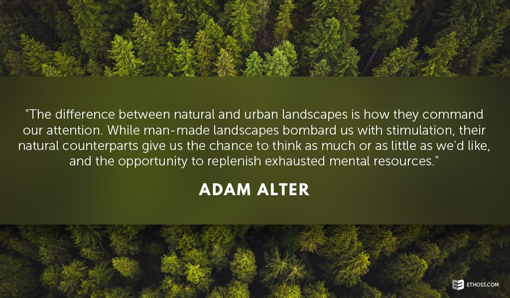
Nature can help us perform better. Writer Adam Alter says natural colors evoke the Attention Restoration Theory, which is “when we expose ourselves to natural environments, even small doses of nature, we are healthier and happier.” The article also cites studies that show people perform better on cognitive tasks when in a natural environment rather than an urban one. Alter says, “man-made landscapes bombard us with stimulation” that demand our attention. Do you ever feel overwhelmed looking at billboards and advertisements on the sides of buildings? These images force our attention. In nature, nothing is asked of us. Alter says nature gives us “the chance to think as much or as little as we’d like.”
Presentation Design Tips
The main takeaways for using natural colors in presentation design are that they help us relax, they organically draw attention and they help us focus. If a natural color scheme and design aesthetic is what you want for your presentation, use these design tips:
– Use big visuals as the backdrop to your message. Tall trees, powerful waterfalls, or an enormous mountain side will captivate the audience as they hear your message.
– Use off-whites, beige, light grays, greens or blues as a background color.
– Add a pop of color like orange or red to highlight an important word, number or figure.
– Write a metaphor about nature in your presentation content. Infuse your design with natural visuals that tie in to your content. For example, paving the path or planting the seed.
A natural color theme for your presentation design will help audience stay focused and relaxed as your present. For more presentation design tips, check out these posts:
Color Theory Basics for Presentation Design
The Scientific Use of Color in Presentation Design
Why Colors Matter (For Your Presentations and Marketing Designs) [VIDEO]
