Are you aiming to help your community in a big way? Every year, countless people like you open a new non-profit in the United States. There are more than 1.5 million non-profits in the country as of 2015. While we applaud your noble efforts, that’s a lot of competition and a crowded industry to make an impact in. That’s exactly why your pitch deck design must stand out. Here are three components that every non-profit pitch deck needs.
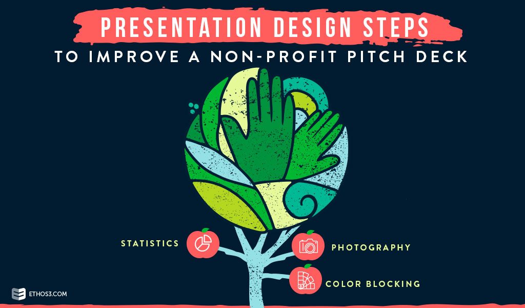
Statistics
Obviously, your presentation content includes important stats that will provide context to the problem your non-profit wants to help solve. But make sure your stats do more than simply highlight the problem – they should provide a shock factor to your story for maximum impact. Your design should stress just how critical the situation is.
- Use an urgent color – like red – to draw the eye, or choose a color that will stand out against your color scheme.
- Make numbers huge. Stats shouldn’t be the same size font as the rest of your text – they should take up a section of the slide to really showcase the figures.
Make your shocking stats the focal point of your slide. You want this information to make a lasting impression on your audience, so use this design step in your non-profit pitch deck for added punch.
Photography
Most non-profit pitch decks include photography as a way to show the real-life journeys of people in need. It’s important to include these photos, because they put a face to a problem. This design step creates an emotional relationship between your audience and the people that you serve, resulting in a bigger impact for your non-profit.
- Use filters to elevate the quality of your photos and create dynamic images.
- Take photos that are not staged. The more nature the moment, the more impact it has on an audience.
Photography can give your audience a real-life glimpse at the mission your organization hopes to achieve. Amp up the effect with some finishing touches.
Related Post: Photoshop Is Expensive, So Here’s The Best Free Photo Editor Software
Color Blocking
A modern approach to presentation design is color blocking. This is a simple yet effective design technique that can make your presentation look sleek and polished. This design can also be used to draw the audience’s eye to important information on the slide.
- Play with the colors, opacity, and lines on your slide to create a unique look.
- Create a template with your color blocking pattern so you always have a go-to design to update as your organization progresses.
Color blocking can help your non-profit pitch deck stand out against other organizations and look fresh and new.
Related Post: 18 Chic and Modern Ways to Use Color Blocking
Non-profit organizations are ambitious and innovative. Let your presentation design reflect these qualities with these three tips. Still want more help to get an unforgettable pitch deck? We can help. Check out our presentation design and presentation training services today!
For more presentation design tips, check out our FREE Presentation Starter Kit and explore these posts:
The 5 Presentation Design Steps All Presenters Should Know [Infographic]
