As you go through the presentation creation process, you’ll research and gather a huge amount of data and information. You’ll sift through everything you’ve collected and select those data points that are most relevant to your presentation message and subject matter. Graphs are wonderful visual tools to implement throughout your deck. But, there are situations where you may be stumped. Should you use a graph or text to convey the point? Here are some tips to help you answer that questions:
When you need it
There are times when the data you need to introduce to your audience is too difficult to explain in any other way than a graph. And sometimes, you’ll have analytical audiences who may demand to see a graph that illustrates your main point. If you’ve brainstormed all of the ways that you could possibly describe the story of a presentation graph and have come up empty-handed, a graph is likely the best method of information dissemination.
When you don’t
If you are only comparing two numbers or statistics, you can refrain from placing a graph for that portion of the presentation. You could create a graph and discover that only one portion of the picture it paints relates to your message. Simple enough. Save your audience the time and effort it takes to assess a graph and tell them directly what part is the most important. For example, write “56% of the faculty likes cheeseburgers” instead of plopping a pie chart or bar graph on the slide. You could even simplify that further by typing “56%” in bold, big text and relaying on your presentation script and speakers notes to hash out the story behind the number.
When you could go either way
At the end of the day, a presenter needs to consider the audience when trying to determine whether or not to display a certain piece of information via graph. How much background, context, or knowledge does your audience have about your presentation topic? If you are presenting to more of a lay audience, you’ll want to err on the side of minimalism. This means potentially steering away from graphical representations of data in order to minimize the cognitive load on this type of audience. Instead, call out visually through text and verbally the most important part of a presentation graph. On the other hand, if you are dealing with an expert audience, using somewhat complex graphs may be the right course of action. What about the middle ground audience? Avoid overwhelming them with presentation graph overload, but do inject a visual representation of main points when necessary.
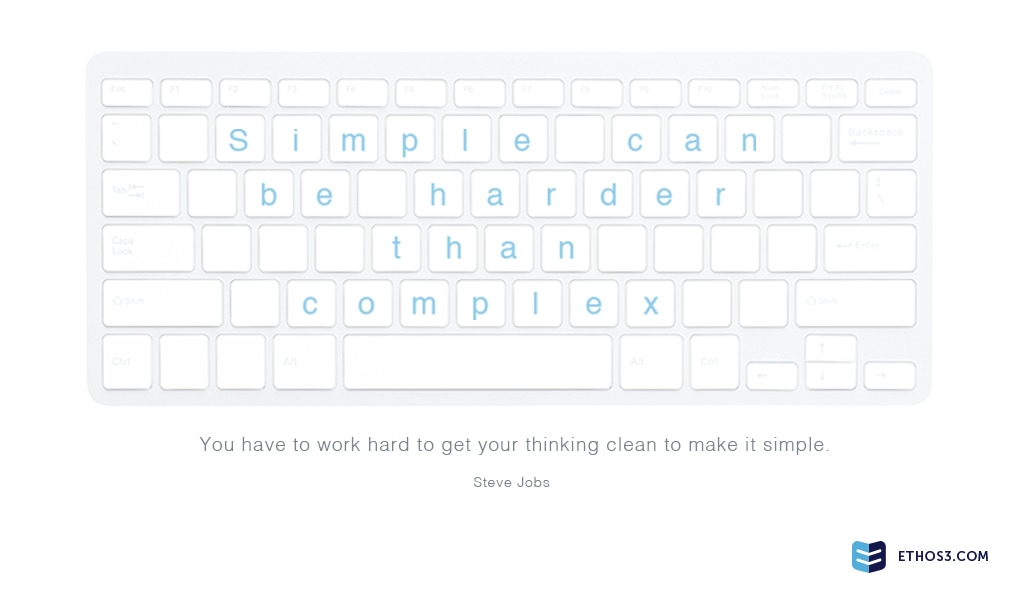
A majority of humans are visual learners, so no matter whether you decide to use a graph or not for a specific slide, you should always have a design element that emphasizes information. Want to learn more about using graphs and other visual resources in your presentations? Read these articles…
Why Good Design Isn’t Cheap Design
How to Develop a Story from Data
Choosing the Right Presentation Narrative for Every Audience