Some might think that attaining $1 million is unfathomable. But did you know that the average person is capable of viewing 1 million colors? The small percentage of lucky individuals who can process colors in the spectrum between red and green are able to to see 100 million colors. To condense the cognitive load created by this bombardment of color, our brains categorize them into broader groups through parts of the frontal lobes. According to UK researchers, the visual cortex of the brain accepts the responsibility of recognizing the minuscule variances in color.
Here’s a breakdown of how our human vision works. Our retina has 3 types of photoreceptors, each one sensitive to a different wavelength – long (red), medium (green), and short (blue). The receptors respond to wavelengths like a person responds to a phone call. The reaction our eyes have depends on our perception of the person on the other line – or in this case, on the ratio of wavelengths. The ability humans have to comprehend color and the way our brains respond to it significantly impact the result of your presentation message. Here are 3 ways you can start using color today to enhance the effectiveness of your message through presentation design:
1. Impact and drive results
Whether it’s a change in emotions or an activation of a particular behavior, colors have the power to dictate what people say or do. For example, when a person sees the color red – maybe it’s the athlete competing against an opponent in a red racing jersey – the response is rapid and dynamic, according to a 2011 study published in Emotion. Even the outcome of fish courtship is highly affected by color – with female Bluefin killifish preferring the attention of yellow robotic fish replicas, as opposed to the red and blue varieties, according to an article published in a 2014 edition of Bioinspiration & Biomimetics. In nearly every aspect of our lives, the color of any object can affect the viewer’s response to it. That’s why the color scheme we choose and the colors we select for specific parts of our deck can make or break our presentation’s goal.
Presentation Tip:
When a piece of text or an image or illustration visually jumps from the page, it is evident that a designer has a full grasp on the isolation effect. The psychological phenomenon explains how audiences remember the content that looked different from the rest of the elements on a single slide. A presentation design based on an analogous color combined with a contrasting complementary color – which plays the isolating role within your design – would be most efficient at relaying crucial messaging. For example, if you are trying to convey to your audience this line – “We need to change, to change the world” – you could use a color scheme using red, red-orange, and orange (analogous) for the more dominant colors and use the color blue (complementary) for the type to serve as an accent and to achieve contrast.
2. Establish order and clarity
Just as newspaper page designers stick to a maximum of 3 fonts in their text layout, an individual serving a presentation design role should also limit their color selections to 3 at the very most. Adobe Kuler users actually insisted on including 3 or fewer colors in a less complex combination for their design according to a University of Toronto study. Beyond limiting main colors in your presentation design, researchers have found that color mixing increases depth in your deck and contributes to ordering the content on slides. According to a study titled Color Design for Illustrative Visualization, using cold colors in the front of a design and warm colors in the back aids the distinction between the foreground and the background. And cold over warm provides more benefit than warm over cold. Not only does the use of warm and cool colors impact the order of presentation content, but the higher the lightness for objects in front and the lower the lightness for objects in the back facilitates the ordering of information in a presentation.
Presentation Tip:
In addition to limiting the number of colors you mix as part of your presentation design, use a high contrast color scheme to emphasize important content and messaging. For example, implementing a triadic color scheme – where hues of equal spacing on the 12-section color wheel are incorporated – will create variety in the design of your deck while also developing a hierarchy, especially if a bright hue is among subdued hues. A simpler approach to establishing order in your presentation design would be to ground your color scheme in complementary colors such as a pairing of blues and oranges or of reds and greens. But to provide the highest degree of clarity, CoSchedule suggests choosing one of the 3 primary colors as the staple of your color scheme – using the primary color’s complement as an accent through header slide sections.
3. Control and alter perception
A 2006 study published in the Journal of Management History, found that individuals glean enough information about another person or about a product within the first 90 seconds of an interaction. Color influences this initial contact by approximately 62 to 90 percent. Designer AdamsMorioka constantly battles the impact of location on his color choice and viewer perception. The Los Angeles resident says that the vibrant, sunshine-filled environment is reflected in every design created – standing out in darker areas like the city streets and alleyways of New York. Furthermore, if the color of a product or presentation does not match the brand identity, it changes how a consumer or audience member perceives the product or presentation. A study titled “The interactive effects of colors and products on perceptions of brand logo appropriateness” discovered the following after testing functional colors in relation to functional items and sensory-social colors in relation to sensory-social items:
“When people know how brands are attempting to position themselves, people consider colors congruent with those positions to be more appropriate.”
Source: “The interactive effects of colors and products on perceptions of brand logo appropriateness”
Presentation Tip:
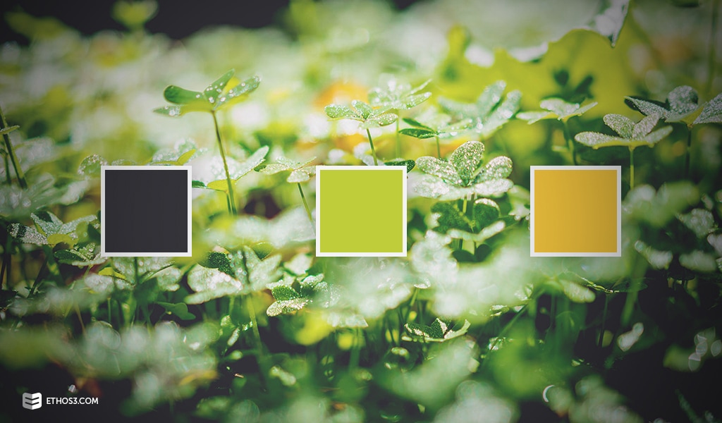
Although most companies have predetermined brand guidelines that indicate a standard color scheme, don’t allow strict adherence to it to handcuff your presentation’s potential. Think outside of the brand box by incorporating a different hue or changing the saturation of one of your master brand colors. Ask yourself this vital question: What’s the goal of my presentation? Consider linking the tone you want to take with the narrative to the mood you want to set through the color scheme to help your audience perceive you in the most accurate light. Let’s say you are a CEO of a health food company that is pitching to city council members and county commissioners to expand your establishment’s locations. The tone you want to set for your presentation would likely be upbeat and energetic. This would probably translate into a color scheme that represented a bright mood. So, your presentation design color scheme might look something like this:
Despite many colors having a long list of associative meanings, the key to success in determining your presentation design is to ensure that the colors chosen reflect the brand, personal, or presenter identity or aligns with the tone you want to cultivate for your audience.
Conclusion
While there are many other design elements that help transport your message, color is one of the most psychologically ingrained in our everyday lives – sometimes preventing or encouraging us to purchase a product or dictating the amount of time we spend in a store or on a website. Because of the visual nature of a presentation, understanding some of the ways color impacts design can help you make the most of your deck and strengthen your overall connection with audiences. For more information on color in presentation design, check out the following resources:
Color Psychology: What the Color of Your Tie Says About You
Design Presentations with Consistent Color Schemes
How Color and Type Can Impact Mood
The 28 best tools for choosing a colour scheme