We see a lot of bad stock photography in our work as a design firm. A lot. The kind of photos that keep us up at night, tossing and turning with worry that someone will use them for their website or presentation.
We also acknowledge that not everyone has an eye for design, or maybe even the budget to hire a designer to help with your projects. But for the sake of our sleep and your final product, here are a few things to watch out for when you are on the fence about a specific photo. Is the image guilty of any of these things?
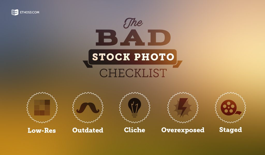
Lo-Res.
This is the easiest way for a non-designer to spot a bad image. If you can’t stretch the photo out without blurring, it’s probably too small or lo-res for your needs. Make sure you know the size requirements for the photo you’ll need, and don’t be fooled by buying the cheapest option in order to save a few bucks and receive the smallest size.
Outdated.
Whether it’s an image of old technology, outdated fashion choices, or simply a strange hairdo, make sure every element in your photo is timely. Ask yourself the question: could this be a photo I see on social media today?
Overexposed.
Another fast way to spot a bad stock image is to check out the lighting. Is it too bright? Are faces washed out? Are details missing from the image because of the way it is lit? Check out this handy article for more help on how to spot good lighting vs. bad.
Cliche.
Imagine these series of stock photo scenes: a happy group of business people around a conference table, a high five, a group of individuals in suits gathered around a computer screen. If they sound familiar, they are. Try not to pick an image that reminds you of something else you’ve seen, or an image that seems “eerily familiar.” There are so many stock photos that express high-level concepts without falling into the cliche trap; just keep searching!
Staged.
If everyone in the photo is smiling at the camera, then the image is very clearly staged. But staging can be more complex and subtle depending on the image. The best photos are those that don’t look as if a photographer spent time arranging each element, creating a more “natural” look. You should always look for photos that feel as if they happened and someone grabbed a camera, not the other way around.
If you’re having a hard time finding the right image for a project, you have a few alternatives. Consider going a more illustrated route rather than using photography, or even taking the photos yourself. If you browse through our website, many of the photos were directly taken at our office of our staff. It gives the overall look a more authentic feel, even though our team isn’t made up of elegant professional models. Finally, if illustration and DIY photography just don’t work for you, consider using more conceptual photography of outdoor scenes or objects in the place of portraits. This is because nature, unlike people, can’t be staged to smile at a computer screen.
Want to learn more about finding and using great stock photography? Check out these handy resources from our archives:
The Ultimate List of Free Stock Photos For Your Presentations