Even within the safety bumpers that a presentation template offers, bad design can rear its head. Your team may feel that so long as the standardized header and footer exists, then they have freedom to create a design monstrosity in the middle. Occasionally, the blame may also fall with the design of the template itself. If it’s not flexible enough to meet your needs, then the cycle of bad design will continue.
When looking for a template or even while designing within an existing template, here are a few common mistakes that we encounter. Are these mistakes weakening your design and making a professional template unsightly?
Custom Fonts
One of the problems a shared company template encounters is the pesky custom font. If the computer displaying the presentation doesn’t have the custom font installed, then PowerPoint will set a default font. This new default could come in a wide range of sizes, messing with the layout of the slides and ruining the overall look. The best way to avoid this mistake is to ensure that each computer has the right font installed, or the template uses a common font like Ariel which can be displayed on every kind of device. It all depends on how many people are using the deck, and if you can trust they are savvy enough to download the custom font.
Bulky File Size
There are two main culprits that can cause a template file size to be too large, thus making it difficult to share and download quickly. The first culprit is a user who inserts elements within the template, like videos, that use existing layouts to hold too much content. The second culprit might be the template itself, with background images that are too high-res to be necessary and functional. As a rule of thumb, if the presentation is over 1 MB, it’s probably too big.
Poor Contrast
This design mistake happens when PowerPoint template designers don’t calculate the effect of font color on backgrounds. When the presentation is used, the display isn’t bright enough to clearly show the text. This could be because the template wasn’t “road tested,” and simply looked good on the computer as they designed. The rule of thumb is easy: the darker the background, the lighter the text needs to be. And the opposite is true with a lighter background. Be mindful of how your text appears on your computer screen, but also try to test them out on a projection screen before settling.
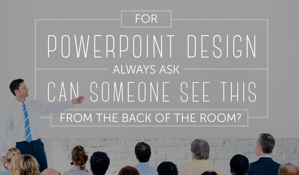
Small Elements
Whether it’s editable text, shapes in the background, or headers and footers, PowerPoint template design is a game of “can someone see this in the back of the room?” Designers want to ensure that there is enough room on a slide for an image, bullet points, and a paragraph of text, but cramming everything onto the slide is an excellent way to make the slide hard to read and impossible to see in the back of the room. For both people using the template and looking for a PowerPoint template design, consider that templates should have plenty of options to accommodate different kinds of content. That means that bullet point slides can be separated from image-only slides, etc. There is no reason to suffer through tiny visual elements: beware of downloading a template that uses size 24 font for a “header” slide.
Want to learn more template best practices or read other fast PowerPoint tips? Check out some of these related articles, and make your next presentation gorgeous!
Your PowerPoint Template Layout Checklist