I consume a crazy amount of content online. I have customized my Facebook feed to show me more news updates than vacation or baby photos. In addition, my job also forces me to constantly seek out fresh content from unique sources, which is a job requirement that I relish so I often indulge in the research process more than is probably necessary. While there are many content sources that I admire, the Buffer blog is always at the top of my list. Not only do I value their in-depth research but I also appreciate their transparency on their internal processes.
For example, check out
The 4 Biggest Pinterest Marketing Mistakes We Made (And How You can Learn From Them)
We Stopped Publishing New Blog Posts For One Month. Here’s What Happened
Inspired by the transparency movement demonstrated by the Buffer blog, I want to share with you an experiment that we conducted here at Ethos3.
The Experiment
In August of 2014, we decided to test a few different ads on Google AdWords.
I was surprised by the results.
Since we are not a social media agency nor Google AdWords consultants, I will spare you the details of my somewhat novice approach to the actual campaign setups.
As a design agency, the performance of the ad graphics intrigued us as much, if not more than, the success of the AdWords settings.
The Graphics
For the Adwords experiment we created 3 different ads.
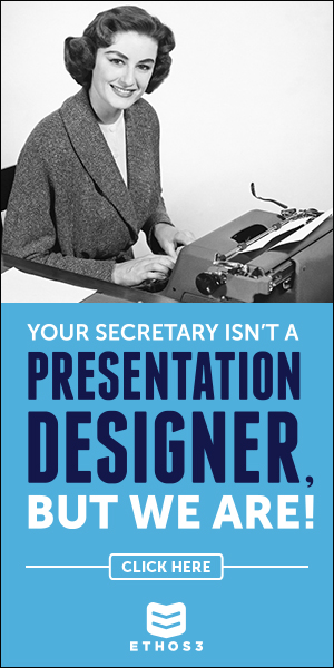

The first ad is what I would call sassy. Some of us thought that because of the saucy copy, the ad was slightly risky as it could be considered somewhat rude.
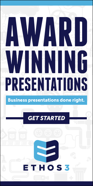
The second ad is in no way cheeky; it could be called safe or conservative as it is void of any questionable comments. It was designed to communicate a clear message, with only minimal design elements to accompany the to-the-point copy.
The third ad is mildly playful but definitely not sassy. The design of the third ad closely resembles the design of the first ad so comparing these two ads can give us some insights specifically into the performance of the copy.
The Results
For the duration of the short campaign trial, these were the results of the ads:
1. The sassy secretary ad received 253 clicks
2. The conservative ad received 138 clicks
3. The mildly playful ad received 73 clicks
The Review
The takeaways from these results will depend on who you are and what elements of the campaigns interest you the most. For me, I was among the skeptics who were concerned that the secretary ad would be too much for the business leaders who fill our client roster and prospect list. I believed that the conservative ad would come out on top with more clicks. Thus, I was intrigued to see that the conservative ad did not generate the same amount of attention as the cheeky secretary ad yet it still outperformed the mild third ad.
In hindsight, it seems like a no-brainer that the sassy ad would cut through all of the noise online and therefore win the race for more clicks. It also seems obvious that the mild ad would create little to no buzz with viewers.
So, now that we have the luxury of hindsight, what inspiration can we take from this experiment for future endeavors?
Well, first of all, being sassy can be a smart business decision.
Secondly, taking a lukewarm approach to communication, as is demonstrated by the third ad, will likely produce less than ideal results. Trying to straddle between being playful and being conservative typically leads to blasé responses.
Whether you are designing graphics for an ad or delivering a presentation at a big conference, my advice to you is the same: be bold in your message and communication style. Don’t be afraid to ruffle a few feathers. If for some reason a sassy style will not work for you, then go to the other end of the spectrum and be serious.
What ever you do though, don’t stand in the middle of the road somewhere between risky and safe because you will probably just get run over by the brave souls who picked a lane and then went for it.