Deciding on a color palette is one of the earliest steps in the creative process. It helps the presentation take shape, granting your deck visual direction. Once decided, the color palette syncs the information on the page with the design direction in a beautiful, cohesive format. Before exploring color schemes, it’s important to ask yourself these three exploratory questions:
1-Is there a specific set of brand standard colors to adhere to? If so, should those standards be strict, or can the color palette take inspiration from those standards and expand appropriately?
2-If there aren’t strict brand color guidelines, what is the mood, tone or emotion you are aiming to convey?
3-Who is the audience? (age, gender, etc.)
Explore/Trends
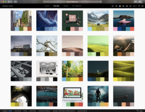
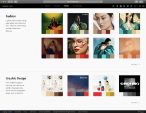
Once these questions are answered, you can begin experimenting with color palettes. A valuable (and free) tool is Adobe Color. A good place to start is with the Explore and Trends tabs. Here, you can find quick inspiration, as these show how color palettes can be extracted from existing designs or photography.
Explore tab:
Trends tab:
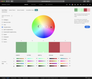
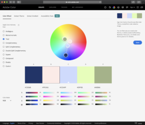
Another valuable tool in Adobe Color is the interactive color wheel under the Create tab. This allows you to play with 10 different types of color schemes. We encourage you to familiarize yourself with each to find your most effective color palette.
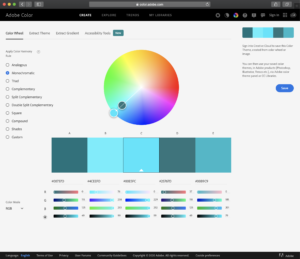
Exact Colors
Once you have your color palette nailed down, you can utilize each exact color. To use the exact colors, simply copy the hexadecimal color code, and paste in to your slide of choice. For example, #1D336B will produce the same rgb dark blue no matter which program you are using.
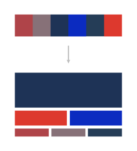

60-30-20 Rule
When utilizing your color schemer, it is important to remember the “60-30-10 Rule”. This simple rule states that 60% of then color used should be the dominant color, while 30% should be the secondary color and 10% should be an accent color. This isn’t a hard and fast rule, but should be generally followed in order to grant the color palette maximum efficacy. Lastly, while white space or text isn’t technically part of the palette, it should always be considered when proportioning color throughout the design.
And there you have it! We hope you enjoy playing with color palettes and honing your exact hexadecimal color codes. If you find yourself in need of other design services, our design team is here to help, as always. Reach out today for a free quote!
