We are all looking for ways to work smarter, not harder, right? When it comes to the world of design and data visualization, there 4 things you can use to create better visual information. They are called preattentive visual properties. I know, it’s a mouthful. But stick with me.
Preattentive visual properties are things which are so natural for our brain to process that we don’t need conscious effort to understand them. In fact, these 4 things are so easy for us to understand that it takes less than 500 milliseconds for the eye and brain to make sense of them. So what are they? In his book Information Visualization: Perception for Design, Colin Ware outlines color, form, movement, and spatial positioning as the four preattentive visual properties. Here’s how you can use these 4 elements to make your visual information more effective.
Color
Our brains quickly notice and assign meaning to colors. For example, if we see a design in a circular shape that is bright red, we might instinctively think it’s an apple. In that way, color helps us understand what we see. Color can be used to draw and focus our attention, as well. Designer Priscilla Esser says, “With the correct contrast, we designers can help users find content that is relevant to their tasks quickly.” Think for example of chart that is presented all in grayscale, except for one column, which is presented in color. When viewing this chart, we know without conscious thought where we are supposed to look first and what information is the most important. It’s the column in color. The designer has communicated hierarchy and importance and has directed the user’s attention and energy simply by tapping into the preattentive visual property of color.
Form
We see form in things like lines, curves, length, weight, number, shape, size, and grouping. Check out this graphic from The Interaction Design Foundation to see how form directs our attention and improves our understanding.
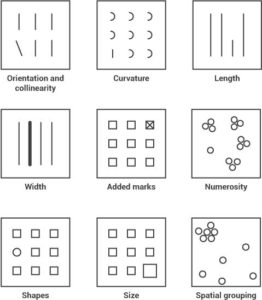
When you use the preattentive visual property of form, you make certain information stand out. And you communicate lots of information in a way that requires very little time or effort to understand it.
Movement
Our eyes are drawn to movement because change attracts our attention. Think about the blinking hazard lights on a vehicle, or a scrolling news banner at the bottom of a tv screen, or a flashing “purchase now” button. We can use movement quite powerfully in our designs. And that doesn’t mean something has to be literally moving. Designers use perceived motion and element relationship to draw attention and increase understanding, as well. 99Designs notes that there are actually 3 categories of movement in design:
- Kinetic—how designs change their position in space and time
- Rhythmic—the way lines, forms, and colors guide the eye throughout a composition
- Illusory motion (or motion illusion)—how elements interact with each other to imply motion
Think about it. When you look at a graphic or data visualization, your eyes make a path through that information. You don’t do it consciously, but they still start somewhere and end somewhere. When designing information, we can use preattentive visual properties to direct that eye movement.
Spatial Positioning
Spatial positioning is concerned with how designers use things like 2D versus 3D images, shading, or depth to communicate visually. For example, the hollow mask illusion is a great example of how our brains quickly make sense of things without conscious effort. In this example, our brains turn a concave face (the hollow mask) into a convex face (like the front of the mask) because we aren’t used to seeing concave faces.
Noses usually point out, rather than in. So our brains transform what we see into a more familiar notion of reality. Our brains will turn flat, 2 dimensional surfaces into 3 dimensional objects when designers use the techniques of spatial positioning to help us see them otherwise.
When you use preattentive visual properties like color, form, movement, and spatial positioning to make your design better, you are really making choices about what to emphasize. Designer Steven Bradley says, ‘A varying degree of emphasis works best. The eye instinctively moves from most to least prominent. If everything is emphasized, then nothing is emphasized.”
At Ethos3, we’ve designed presentations for some of the most admired brands in the world. Check out our full line of presentation design resources now.
