So you’ve been asked to design or deliver a virtual presentation. If you are used to face-to-face presentations this can be a bit intimidating. However, don’t let this format shift scare you. Much of what makes a presentation great in person can be translated to work for online presentations, as well.
With any type of presentation, two of your main goals are to maintain audience attention and communicate clearly. In order to accomplish that in virtual presentations, focus on these three design tips: use images, leverage motion and contrast, and feature people and stories.
Use Images Rather Than Text
When it comes to virtual presentations, science proves that our designs should be image based rather than text based. Here’s why.
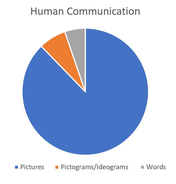
Human beings have been communicating via visuals for the most of our history, so it’s quite natural for us to process and remember pictures better than words. That can be hard to understand since our current experience has been largely text-based. However, if we look at the grand scope of human history, pictures are our preferred and dominate method of communication. The book The Telling Image: The Changing Balance Between Pictures and Words in a Technological Age breaks down the way have humans have communicated across history. For 250 centuries we used pictures. Then we used pictograms and ideograms for the next 20 centuries, and words for the last 15 centuries.
Research on visual patterning also tells us that we not only process visual information more quickly, but we fixate longer on visual scenes than we do on text. In addition, much of the text we so carefully craft for our virtual presentations gets lost. “Readers only fixate on about 70% of the words in the text, skipping the other 30%.” If that’s not enough proof of the power of visuals, check out this research by Howard W. Levie and Richard Lentz. They reviewed 155 studies and found that when text is accompanied by visuals, understanding increased in 98% of those studies. That’s because “pictures facilitate learning by providing clarifying examples, extra-lingual information, contexts for interpretation, and redundancy which aids recall.”
So when we create virtual presentations that are heavy on visuals, we are appealing to the visual orientation of human beings. And we are presenting information the way our brains understand it best.
Leverage Motion & Contrast
It’s not just about how our brains process information best, though. We need to understand what draws our attention, and then use this information to design presentations to keep our audience engaged. When we are designing or delivering virtual presentations, we have no control over the environment in which our audience is viewing that presentation. That means our visuals have to work harder to gain and maintain attention. It can help to know that our eyes are involuntarily drawn to motion and contrast.
While we might think that the screen itself (a light source) would pull attention, it’s not actually the light that gets our attention. It’s the change—the motion and the contrast. Research shows that simply having a bright screen isn’t attractive to us, but having a screen in which images change, is.
Here’s how that scientific knowledge should affect our design process. Rather than cramming one slide full of information, break it down. Each slide should work to communicate just one thing. This helps you keep your visuals simple and makes them easier for your audience to process. It also keeps your audience engaged because the screen is changing more often.
Feature People & Stories
One of the things we lose when we move from presenting in person to presenting in a virtual format is the element of human connection. The way to make up for this loss is to feature people and stories in your presentation design. Without even realizing it, we can design presentations about human issues, to solve human problems, which affect real human beings without ever talking about or showing humans. That’s a problem.
Brain imaging research has proven that our brains literally “light up” when listening to a story. When you simply deliver a PowerPoint with bullet points of text, it only activates two brain regions: Wernicke’s area (responsible for language comprehension) and Broca’s area (responsible for language processing and comprehension). However, when you tell a story, it can activate those two brain regions plus five more: the motor cortex (movement), the sensory cortex & cerebellum (touch), the olfactory cortex (scents), the auditory cortex (sounds), and the visual cortex (colors and shapes).
That means virtual presentation design needs to bring in human faces and human stories. Well-designed graphics can communicate statistics and information in beautiful and moving ways. But use these graphics as part of stories, and don’t underestimate the power of the human face.
Want more tips for designing great virtual presentations? Check out this blog on yoyomeeting where our CEO, Scott Schwertly, recently shared some of his best virtual presentation design tips.
Ethos3 can help you develop, design, and deliver in-person or virtual presentations with stunning visuals and compelling narratives. See how.
