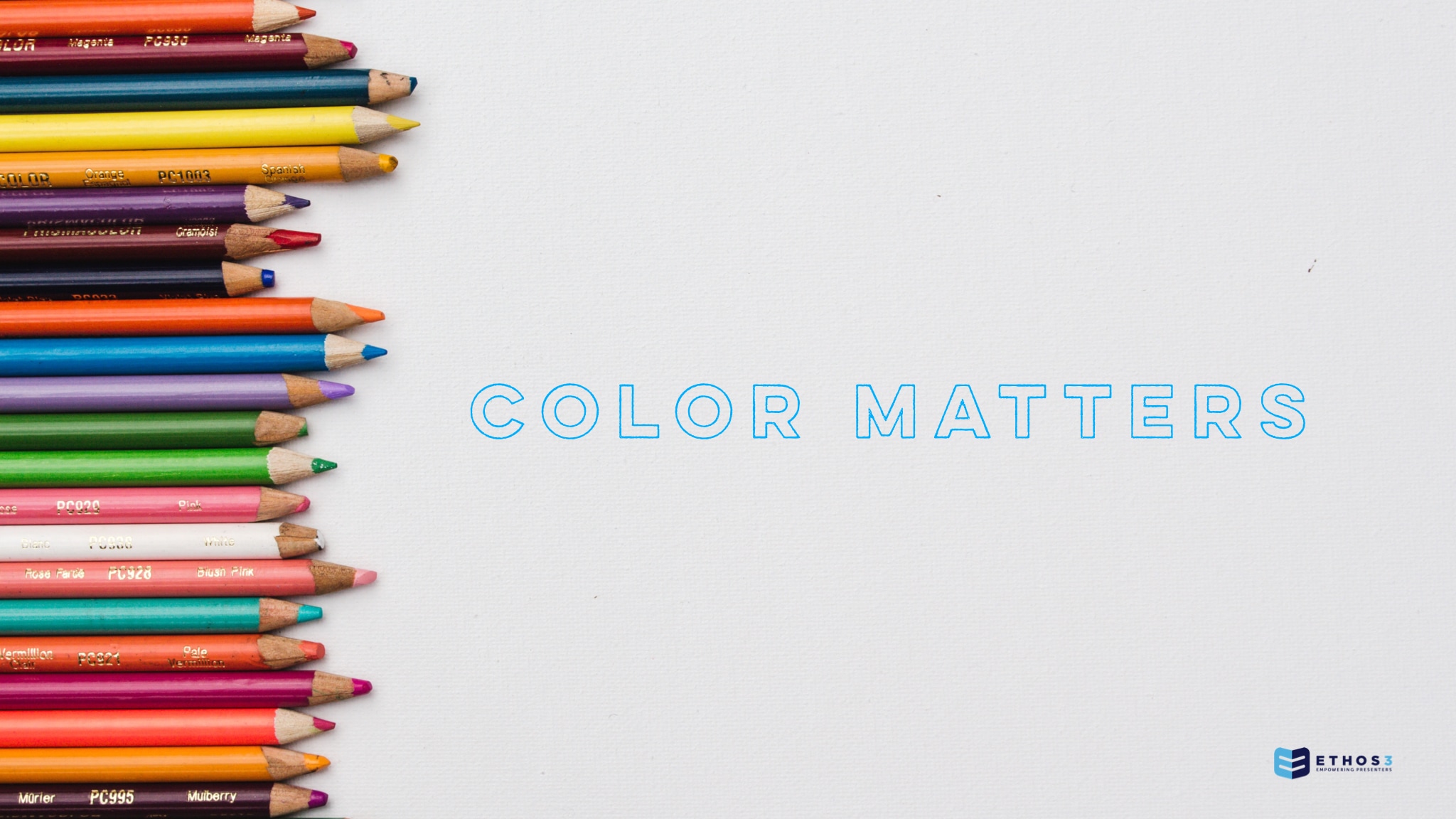
Creating a clean presentation design requires a presenter to combine great imagery, clean fonts, and impactful colors. While the bulk of the focus is often placed on the imagery and words that are placed on the screen, studies have shown that the colors a presenter chooses are extremely important to the design and the audience’s attention and retention as well. Colors affect our emotions, and some studies have shown that colors even have the ability to affect performance.
With so many colors available, it’s important to know where to start and how to select the right color palette for your presentation. We have put together three tips for selecting the best colors for your next presentation design.
Choose contrasting colors.
When selecting background and font color, it’s important to select contrasting colors. Contrast allows the font to stand out from the background and pop off the screen. This makes the information more aesthetically pleasing while making it easier for the audience to read and comprehend the information quicker.
Color ideas:
Light Font on Dark Background
Dark Font on Light Background
Select colors that match the emotion of your presentation.
There are countless studies that show color has a large effect on our emotions. When creating your presentation design, make sure the colors of your presentation match the emotion you’re hoping your audience will feel.
Color Ideas:
Black | Heavy, mournful, highly technical, formal, death
Brown | Earth, simplicity, outdoors
Blue | Peace, tranquility, trust, confidence, security
Purple | Royalty, wisdom, spirituality, mystery
Green | Nature, environment, health, reptiles, insects
Gray | Conservative, practical, reliability, security, staid
Red | Passion, excitement, love, intensity, heat, aggression
Yellow | Optimism, happiness, idealism, imagination
White | Purity, reverence, cleanliness, simplicity
Keep it consistent.
While it’s important to use color to evoke emotion, it’s equally important to keep things consistent within your design. Select a color palette that ensures your design feels clean and put together. Switching up colors can jar your audience and become a distraction for them; if you want to convey different emotions or energies throughout your presentation, make sure you select complementary colors that work well together as you change tones. View your presentation as a whole piece rather than as individual sections when you’re designing to create a look and feel that’s cohesive and pleasing throughout.
Color Ideas:
Unsure of what a color palette is? Check out some popular options here.
Choosing the right colors doesn’t need to be complicated, and it definitely should not be overlooked. Compelling visuals lead to increased information retention, and colors are a great way to elevate your visuals to complement your presentation and heighten your message.
The team at Ethos3 would love to help you hash out your visuals and create a sleek design. Contact us today for more information.
