As a presenter, TED Talks are one of the most inspiring forms of entertainment. Watching men and women stand in front of their peers and share a thought that has inspired their worldview evokes a sense of vulnerability and courage in everyone who watches. That is why I am always on the lookout for new TED Talks that will inspire me to hone my own worldview.
Recently, I watched a TED Talk given by Christoph Niemann where he spoke on the idea that “You are all fluent in a language (and you don’t even know it).” The language Christoph is talking about is the language of visuals. He opens his talk by explaining that humans are capable of understanding visuals much more easily than the written word.
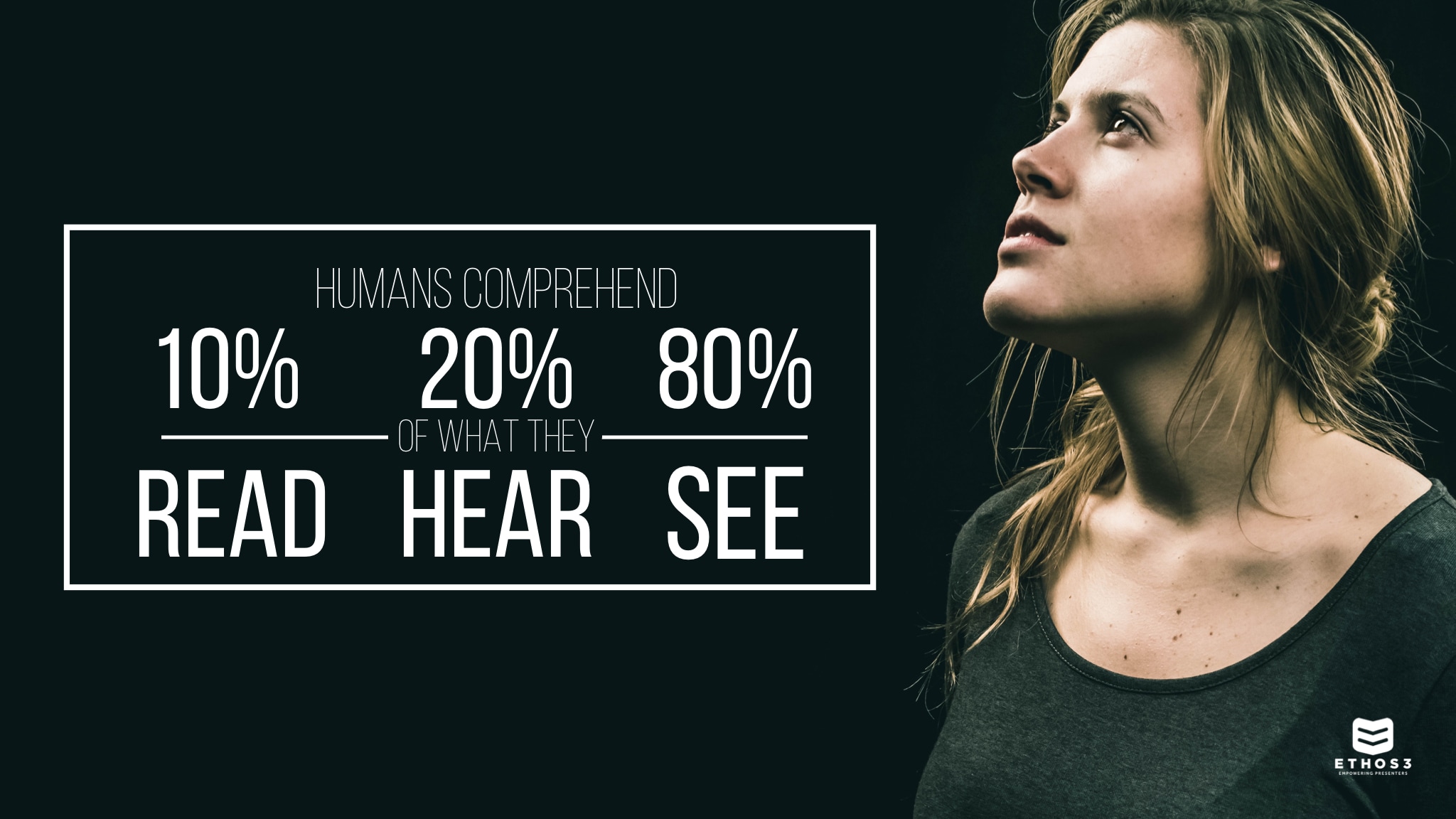
Christoph is exactly right. In fact, did you know that people will remember 20% of what they read, 10% of what they hear, and 80% of what they see? I don’t know about you, but as a person whose profession is speaking to other people, this statistic makes me think long and hard about the way that I use visuals to communicate a message.
Christoph goes on to discuss how visual images are able to communicate what words can’t. He also talks about how the deeper a concept is etched into our consciousness, the less detail is needed in an associated visual. Then Christoph drops a truth bomb that must shape how we as presenters design our visuals. He said, “As a designer, I must have a good understanding of the visual and cultural understanding of the audience.” That statement struck me to the core when I thought about the different presentations I’ve given. Here’s why:
As presenters and designers, we love what we do. Each presentation we write or slide we design is a piece of our unique creativity exposed for the world. However, this mindset often leads us to create what we love and are passionate about. This is why if you look at multiple presentations from the same designer, what you will often find is a similar look and feel throughout their visuals. Sure, we’re naturally inclined to create what we are passionate about. But when it comes to creating visuals and designs for an audience, we have to shift our focus and create what our audience understands.
We must learn to view each design through the lens of our audience and gear any presentation, just like Christoph suggests, toward the visual and cultural understanding of our audience. By doing this, we unlock a whole different space of creativity, allowing ourselves to create more abstract and creative designs, and as a plus, our audience will have the conscious understanding to make the connection, too.
The reality is that the more we seek to understand our audience, their context, their culture, and their understanding, the more room we have to explore our creativity. By doing the hard work on the front end, we are unlocking our freedom of design and engaging our audience. So next time you are about to write a presentation or design a powerful visual, stop and ask yourself who is this for? I promise your audience will thank you.
Unsure of where to start on your next design? Check out the Ethos3 Design Toolbox today.
