Big Data is different from targeted data—information collected methodically in a controlled environment in an attempt to answer a specific question. A raw data dump can be intimidating and overwhelming. You know this stuff is valuable. You know you can use this heap of seemingly infinite numbers and characteristics in a literally infinite number of ways. And that’s paralyzing.
How do you exploit this incredible value? How do you make these numbers work for you to further your goals?
1) Figure out your questions.
Are you trying to highlight your sales figures? Your performance in comparison to a competitor? The longevity of your product? Who uses your product and why?
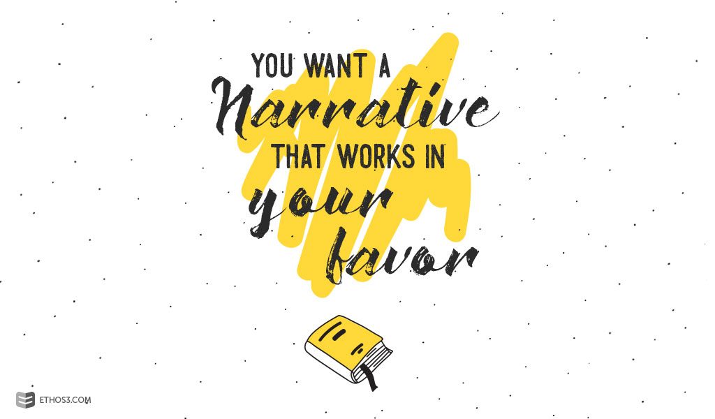
If you’re using big data for marketing purposes, you want a narrative that works in your favor. This means you should probably ask questions you can already answer, based on previous data. You just need fresh, verified stats to back up your successful scenario.
If you’re using big data internally, you want to discover new information that will help you tailor your product or target your marketing, so you’ll ask a different set of questions.
2) Use visuals.
Numbers terrify people, often even when organized into charts and tables. If you’re using data in a presentation, you need to translate those numbers into something appealing and accessible.
When you know your questions—or rather, what kind of comparisons you want to make— it’s a lot easier to know your visuals. Often graphs will be your best option.
But graphs are as scary as figures if you’re not used to working with them. (Luckily, graphs are an Ethos3 specialty, so if you need some extra guidance, hit us up!)
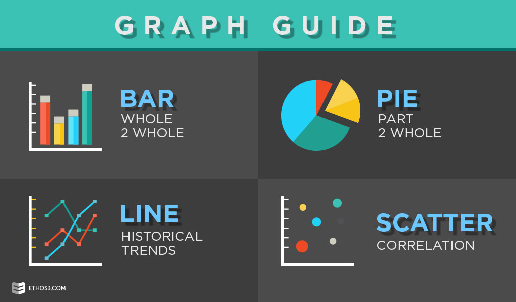
Briefly:
• Bar, cylinder or pyramid graphs work for whole-to-whole comparisons.
• Pie graphs are great for part-to-whole comparisons, but they can be imprecise and are most useful if you’re making a broad point or your data supports an obvious conclusion.
• Line graphs are good for historical comparisons.
• Scatter graphs work well for showing correlation.
3) Keep it simple.
We know you gathered snazzy data and cleverly analyzed that data. And you’d probably really like your audience to know that, too. But fight the urge to usher them behind the green curtain. Unless your audience is technically sophisticated, over-explaining and presenting tangential data—gorgeous as it may be—is confusing and unnecessary.
You’re giving the group the visual equivalent of a sound bite. If they wanted a lecture, they’d be sitting in a classroom rather than a boardroom. A good rule of a thumb: if your analysis can’t be summarized in a sentence or two, save it for the peer-reviewed journal.
4) Get creative.
Pie and bar graphs can be well-executed and effective, but sometimes a particular audience—or a point you want to particularly stand out—warrants something unexpected.
It’s called the von Restorff effect, which most of us know as the element of surprise. It predicts that with multiple similar stimuli present, the one that differs will be remembered.
Maybe you use emojis in your scatter chart. Or you use bar graphs for all the data except the primary data you want to highlight—for that, you use a graph embedded in an illustration. Maybe the narrative of your data lends itself to animation or a flow chart. If your situation is flexible, we 100% recommend an artistic presentation of data.
5) But don’t get cluttered.
If you go the creative route, or even if you don’t, keep in mind that as humans, we’re all trying to function in a world of constant stimulation. And stimulation is fun until it’s stressful. We’re guessing that stress is not your target takeaway.
So keep your audience in warm fuzzy territory by not cramming too much info into a single graph and making things visually clean.
You may also want to shut up for a second! Seriously. Your audience needs a few moments of silence to take in a meaty visual. Research published in the Journal of Neuroscience has shown that our bandwidth for processing sensory input is limited, so focusing on a complex visual will reduce our capacity to process sound.
And find a talented designer who knows how to think visually, because “little” things like font, title placement, and color can make a big difference in how quickly your information is processed and how easily it’s recalled. (We think we know a few someones who can help – wink, wink!)
As we’ve already mentioned, the point of your data is to tell a story. Your audience should know what happened, what it means and what you’re going to do about it. The actual data is a glorious but unsung hero, supporting your narrative without intruding.
If you’re unsure about maintaining this balance (because, you know, big data has an ego), you may need to call in reinforcements. At Ethos3, we’re data experts, designers, artists and most importantly, storytellers. We know how to mold data into the kingmaker, while allowing your narrative to reign supreme. So if you’re feeling overwhelmed and intimidated by big data right now, close your eyes, block out some of that hyper-stimulation, and remind yourself that help is only a free quote away.
