With the New Year comes new trends for industries in every market. In the presentation world, we have seen the rise in storytelling, design directions and nonverbal communication. The emerging presentation trend for 2018 is predicted to be data storytelling. The marketing technology experts at MarTechSeries says data storytelling will evolve into a must-have for presentations. This article will explain why data storytelling is so important for presentations next year and how you can achieve it.
The Value of Data
Throughout 2017, I have seen articles dispute the story-focused presentations that we have come to know and love. Instead, other presentation columnist argue that data is equally important especially depending on your audience. Presentations that ignore or leave out important data could risk excluding an entire group of their audience. Simply put, people who work with numbers everyday will want to see the data. People who do not will respond more to stories. Having a happy medium is the new presentation trend known as data storytelling.
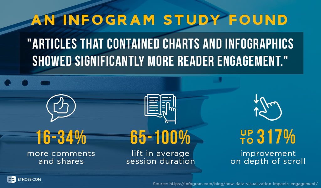
New research shows using data to tell stories has a bigger impact. An Infogram study found that articles with charts and infographics created more reader engagement. Readers were more likely to share, comment and read the entire article when it featured a visual for data. Keeping readers engaged is a huge improvement. Data storytelling will do the same for your presentation audience.
Find the Story
The trick to data storytelling is that every piece of data comes with a story. Audiences don’t want to see too much text or numbers on a slide. Create a healthy balance by focusing on the most important piece of data, then following that slide with some context. Public speaking expert Melissa Marshall recommends making analogies or telling the story behind how you got the data. Analogies can simplify complex messages. Stories can come from your personal experience or case studies.
That’s the fundamentals behind data storytelling. Include your data but make it easy to understand. Don’t overload your audience with too many numbers at once. Then create your story around the data to provide the context needed for your audience. The last part missing for your data storytelling is the design.
Design Engaging Data
Now that you know how to tell a story out of your data, the biggest part of this presentation trend is the design. A design can work for or against your data storytelling ideas. Too many elements can cause chaos across the slides. Too little elements and your data and story may not connect. It’s important to establish an overall theme, color scheme and visual direction before you begin designing.
Some design ideas that could work for your data storytelling slides include:
Infographics that flow directly from one slide to the next.
Color-blocking to pair up slides that correspond to each other.
Icons or images that relate to each other from slide to slide.
Animations to display one part of the slide at a time.
Take inspiration from our Design Portfolio to see how we have created engaging slides for presentations.
Presentations in 2018 will have to speak to every type of audience member. Data storytelling is the right approach to meeting their needs. Follow these tips to achieve an effective presentation that audiences will understand and remember.
More posts from the Ethos3 Blog:
