Understanding the psychology of colors, fonts and shapes increases the impact of your presentation design. These design tips will offer insights on how to use these design elements in your presentation that will better market your message. Research shows that simply using the right color can lead to more leads. A study by WishPod found a 14.5% increase in conversions after changing their call to action button from yellow to green. Design matters a lot when successfully marketing a presentation.
Apply these design psychology basics from Venngage to your presentation design!
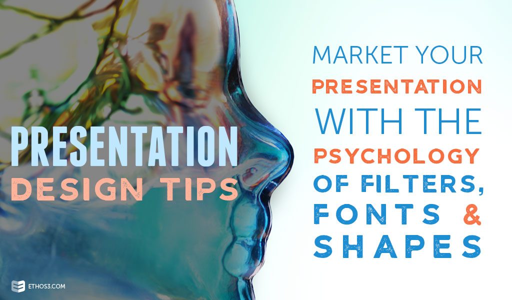
Filters
Filtered photos are a popular presentation design trend. More and more presentation are dressing up stock photography with color overlays that match their mood and tone. Be mindful that certain colors evoke certain emotions. Warms colors like yellow, red and orange often translate to excitement, energetic and creative. Cool colors like blue, green and purple are linked to tranquility, peacefulness and well-being. To make your message resonate, use appropriate colors to match your tone.
Fonts
The type you use in a presentation design will send signals to your audience. Each font has a personality. The Content Group labels each type of typography with their associated traits:
Serif: authority, tradition, respect.
Sans-serif: clean, modern, stable.
Slab serif: strong, modern, solid.
Script: feminine, elegant, friendly.
Modern: fashionable, sharp, intelligent.
Ethos3 created this infographic to share how different types of fonts can impact presentation design.
Shapes
Using shapes as text boxes, photo frames or background add engaging layers to slides. Venngage reports that circles rely messages of friendship and unity; triangles and squares send messages of strength and stability; vertical lines can be aggressive, and horizontal lines are signs of calm and community.
Consider closely each design element that you want to include in your presentation. You could be sending mixed messages if your tone is not cohesive. By understanding the psychology of colors, fonts and shapes, you can give a bigger impact with your presentation and reach marketing success. For more presentation design tips, check out these posts:
The Psychology of Natural Colors for Presentation Design
The Science of Simple Logo Designs
Create Memorable Presentations With These 2 Psychology Tricks
