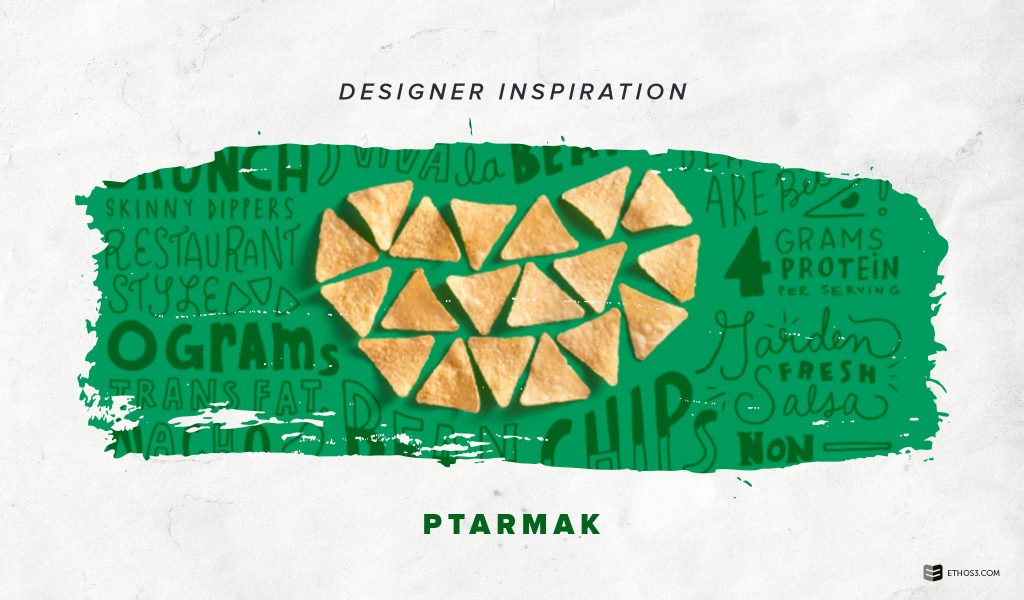
If you are a start-up business or interested in changing up your company’s branding, take some inspiration from this “band of brandits” known as PTARMAK. This group of graphic designers, based out of Austin, Texas, have developed branding images for a variety of companies. Much like how presentation design must match a company’s tone and vision, PTARMAK work to find the right imagery for the perfect branding. If you are expanding your brand for your presentation design, here are some tips to take from PTARMAK.
Presentation Design Inspiration: PTARMAK
Tone
Source: PTARMAK
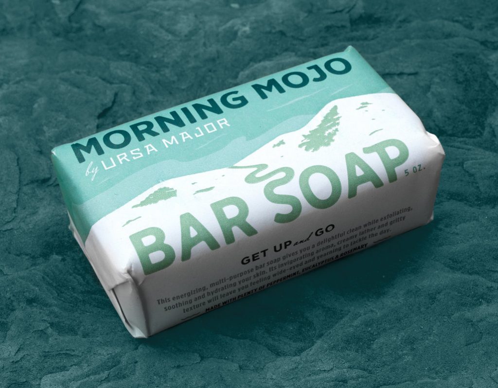
Matching the overall tone for your company’s product or service is a must for creating an effective brand. Let’s look at PTARMAK’s design for Ursa Major. The product is a natural soap bar. PTARMAK was mindful of the colors and style. First, the color choice evokes a calm and serene tone. Then, the soft illustration lines create a natural landscape as a background, with a steady stream or pathway forming the letter “S”. This design stays on the path for Ursa Major’s tone while adding a fresh and unique look. For your presentation design, always be thoughtful of the tone you want to achieve.
Imagery
Source: PTARMAK
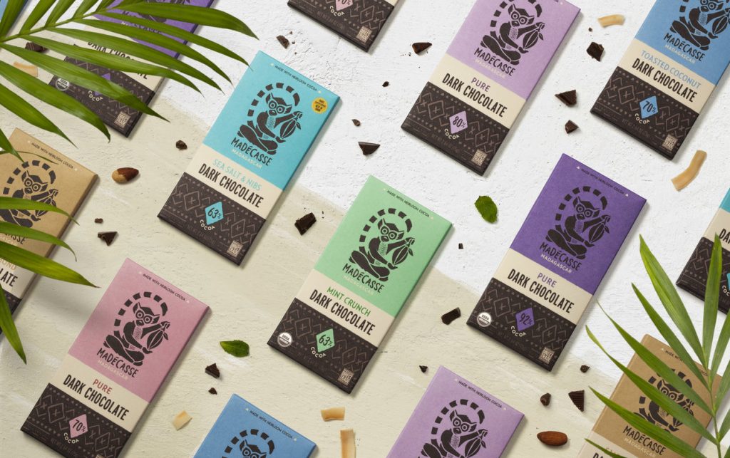
What will be the image your brand is recognized for? Almost every major industry leader has a singular image that sells products. Think of Apple’s apple or the Nike checkmark. Choose an image that you want to share with the world. For Madecasse, a chocolate company, PTARMAK chose an image that relates to the company’s roots in Madagascar. The little spider monkey is an effective design because it matches the company’s cute and animated character. Images can be incorporated in more ways than branding. Use them in icons or illustrations for your presentation designs.
Fonts

Source: PTARMAK
An important element of branding is the font. It may feel like an afterthought, but fonts should be carefully considered. Fonts affect how we interpret and receive a message. Simplicity and quality are key to finding the right font for your brand. Look at the font choice PTARMAK made for Rhythm Superfoods. The company’s name is written out through a fun and funky font that is unique. The rest of the packaging is simple and straightforward, so the customer knows exactly what they are getting. This is a good rule of thumb for presentation design. Headings and subheadings can be typed out with a creative and bold font, but make sure your information is direct for your audience.
For more tips and tricks for presentation design, check out these articles from the Ethos3 blog:
How to Choose Fonts for Presentation Design
4 Ways to Set the Tone for Your Presentation Design
Impactful Presentation Imagery: A New Study Reveals Its Power
