An Indiana native and former San Francisco Bay Area resident, Nathaniel Russell’s design work is a unique combination of quaint simplicity and electric energy. His print works vacillate between monotone color schemes with patterned textures and anthropological interpretations of coastal landscapes.
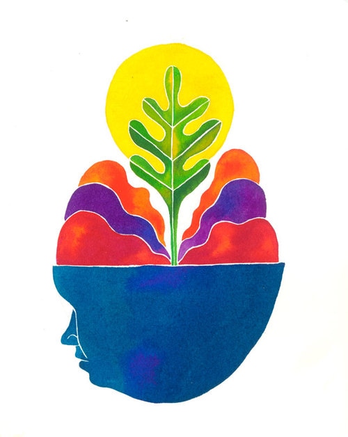
Source: Nathaniel Russell
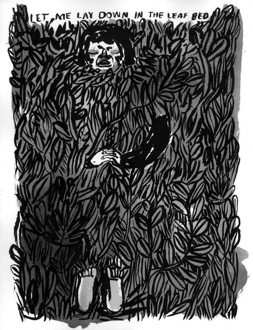
Source: Nathaniel Russell
The typographical elements included on pieces like the posters featured on his website appear rudimentary. But, it captures an informal mood and conveys an overall relaxed tone. Russell’s art teases the eyes, while emitting messages clearly and concisely. Viewers will find that they can quickly distill the meaning behind the graphic layout and design, but will continue to look at the material for several more minutes – admiring the details and depth.
Presentation Design Inspiration from Nathaniel Russell
Although Russell isn’t a presentation designer, he uses design principles in his artwork that can and should be duplicated in your slides. Whether you are delivering a sales presentation, a webinar to promote your thought leadership, or a training seminar to new employees, style and statement are components you need to consider and capitalize on as a distinction between yourself and competitors.
Style
Even if your company has brand guidelines that you must abide by, you can still utilize other presentation design techniques beyond color scheme and fonts. Your presentations can establish a style that shines brighter than your competitors’ through sharp illustrations, compelling photography, clean iconography, diverse texture, and smart layering for additional dimension. Don’t resist the urge to look different. There is a fine line between trying a new design approach and taking a visual risk, so test the waters to find out what works and what doesn’t with your audiences.
Statement
At a podcast Meetup a few weeks ago, the speaker, David Hopper, introduced the concept of sticking to your authentic beliefs and clinging to your unique perspective. A podcastor’s personality is the factor that separates him or her from the masses. The same is true of your presentations. And while you may not necessarily have the liberty to speak unfiltered through your slide copy or speaker’s notes, your visuals can carry the weight of distinction. One way Russell incorporates personality into his designs is through his particular method for illustrating teeth.
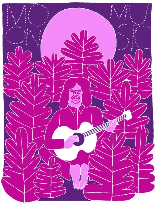
Source: Nathaniel Russell
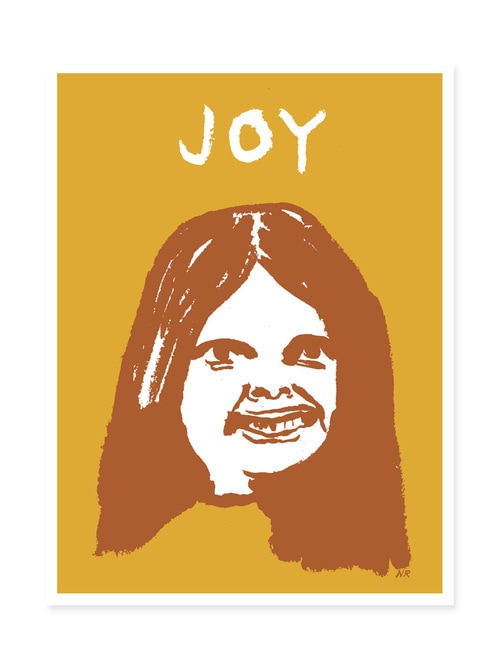
Source: Nathaniel Russell
He’s making his own subtle statement about human appearance and behavior through his portrayal of faces. So, with your presentation design, not only do you need to establish a personal style, but you also should aim to make a statement.
The bolder you can be on the design front, the more attention you can grab from audience members. For more presentation design inspiration, consult the Ethos3 archives!
Presentation Design Inspiration: Mikey Burton
Presentation Design Inspiration: Jessica Hische
Presentation Design Inspiration: Team Dream