Your startup’s pitch deck is guaranteed only 3 minutes and 44 seconds of an investor’s time. DocSend conducted a study of 200 investor pitch decks – discovering that the quantity of investors a startup accrues is worthless if they aren’t quality additions. The ability to steer your main points from concepts to considerations in your pitch decks takes more than a well-crafted narrative. The following presentation design principles will guide you towards creating investor pitch decks with maximum impact and encourage you to establish a lasting impression.
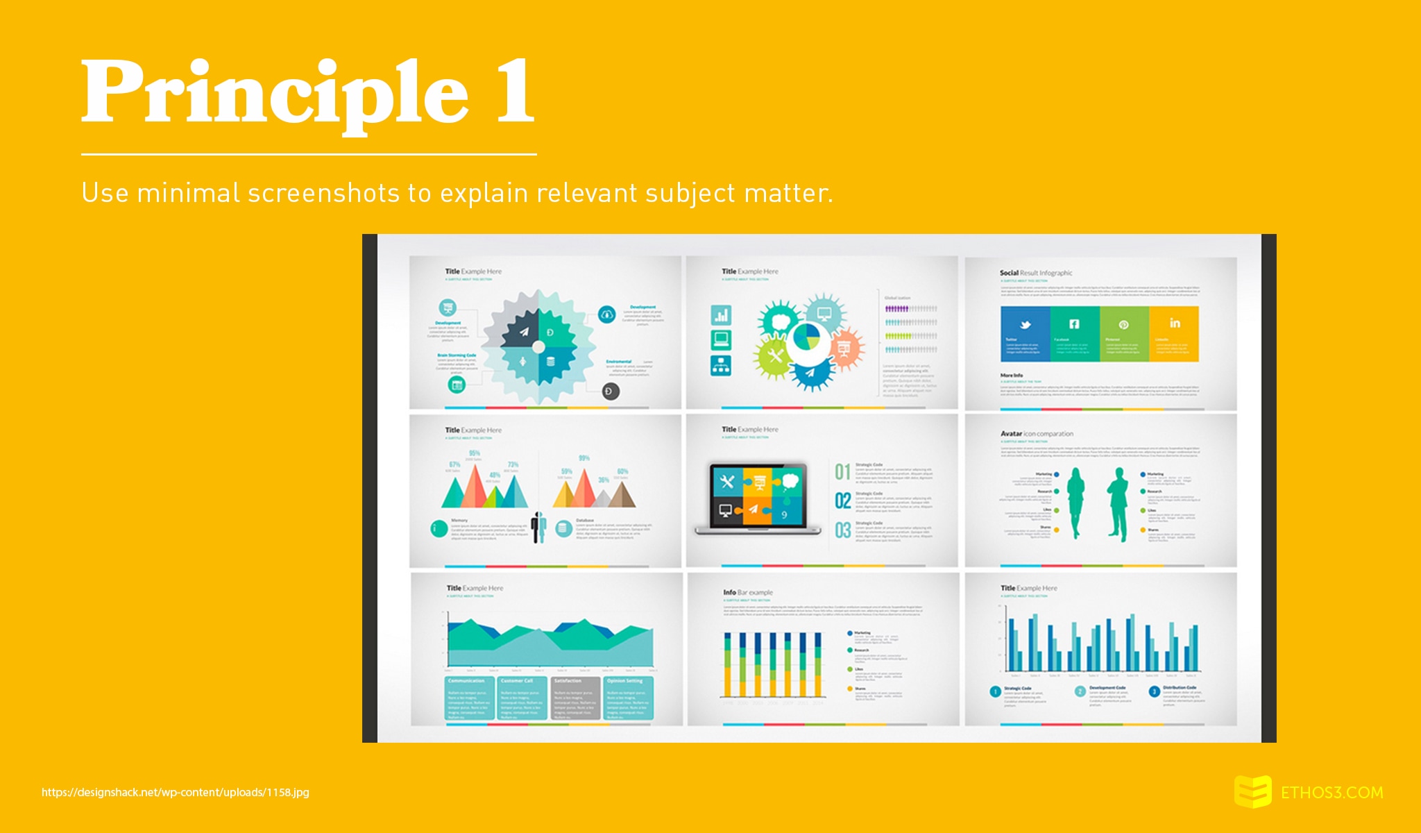
Screenshots are especially effective for products and services that involve a particular process. In the presentation design of investor pitch decks, creators may be tempted to plaster one screenshot after another onto the slides. A more clean and sophisticated approach would be to strategically import key screenshots and integrate them into the laptop or mobile device screen of an individual in a stock photography file.
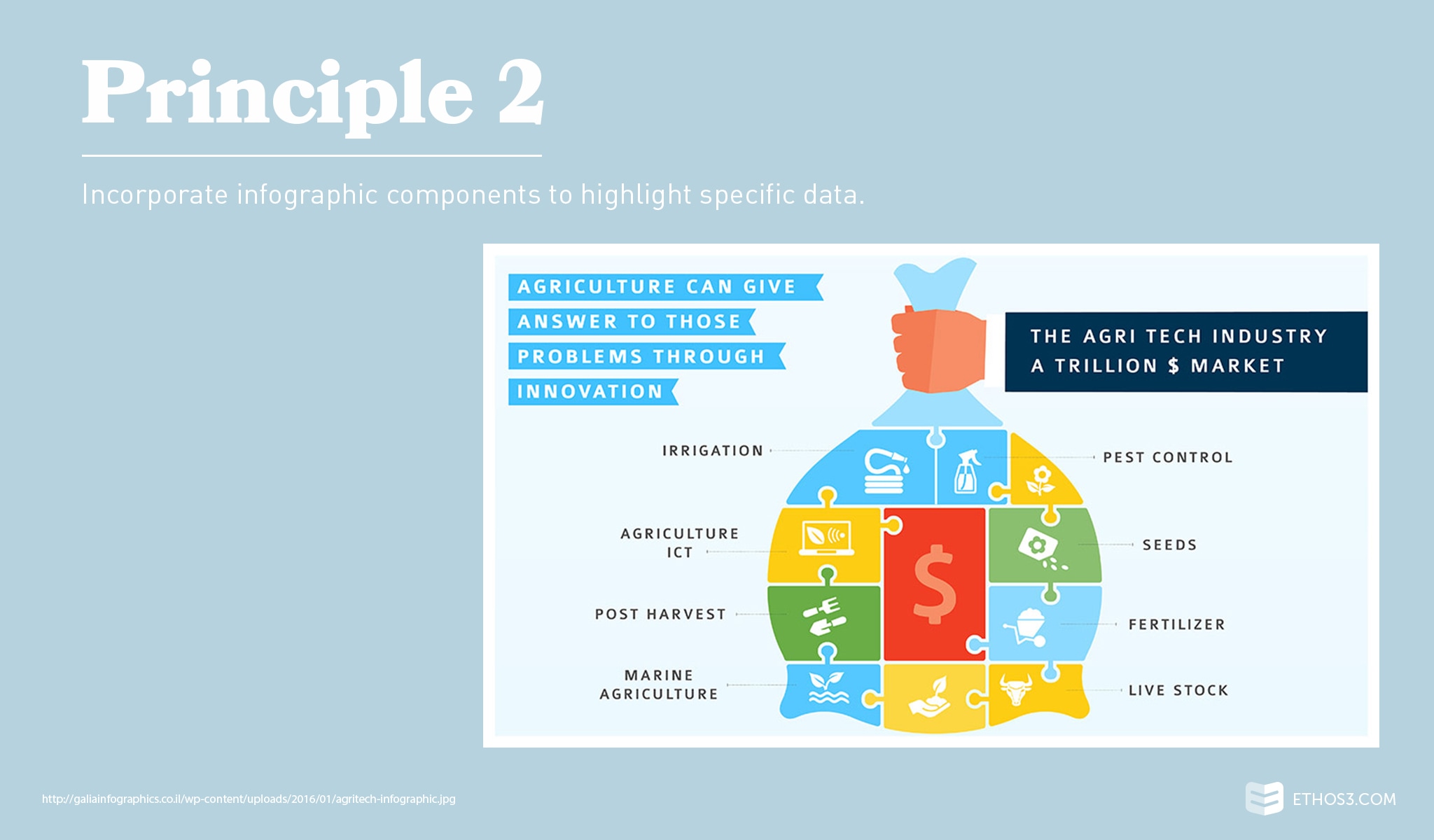
To limit the amount of graphs and charts you may be inclined to clutter your slides with, use an infographic layout and design for particular pieces of information. For example, your market validation or market size slide is a great opportunity to visually depict how your solutions fits into the bigger picture of an industry. Use big typography mixed with illustrative shapes and conceptual graphics to convey the core messages.
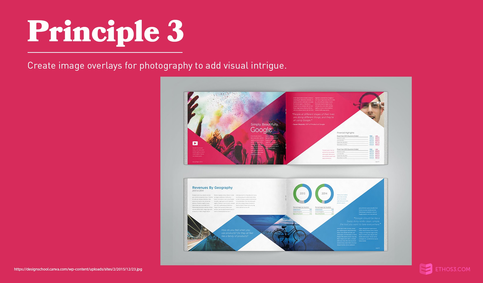
Oftentimes, I work with clients who opt to stay away from using stock photography. But, stock photography can be a huge visual asset for your investor pitch decks. Split a slide in half – with one side including an image with an overlay and the other side with a short list of information. Another presentation design option would be to fill an entire slide with an image and corresponding overlay, then place header text on top of it. Use this method to signal the start of a new section of your pitch.
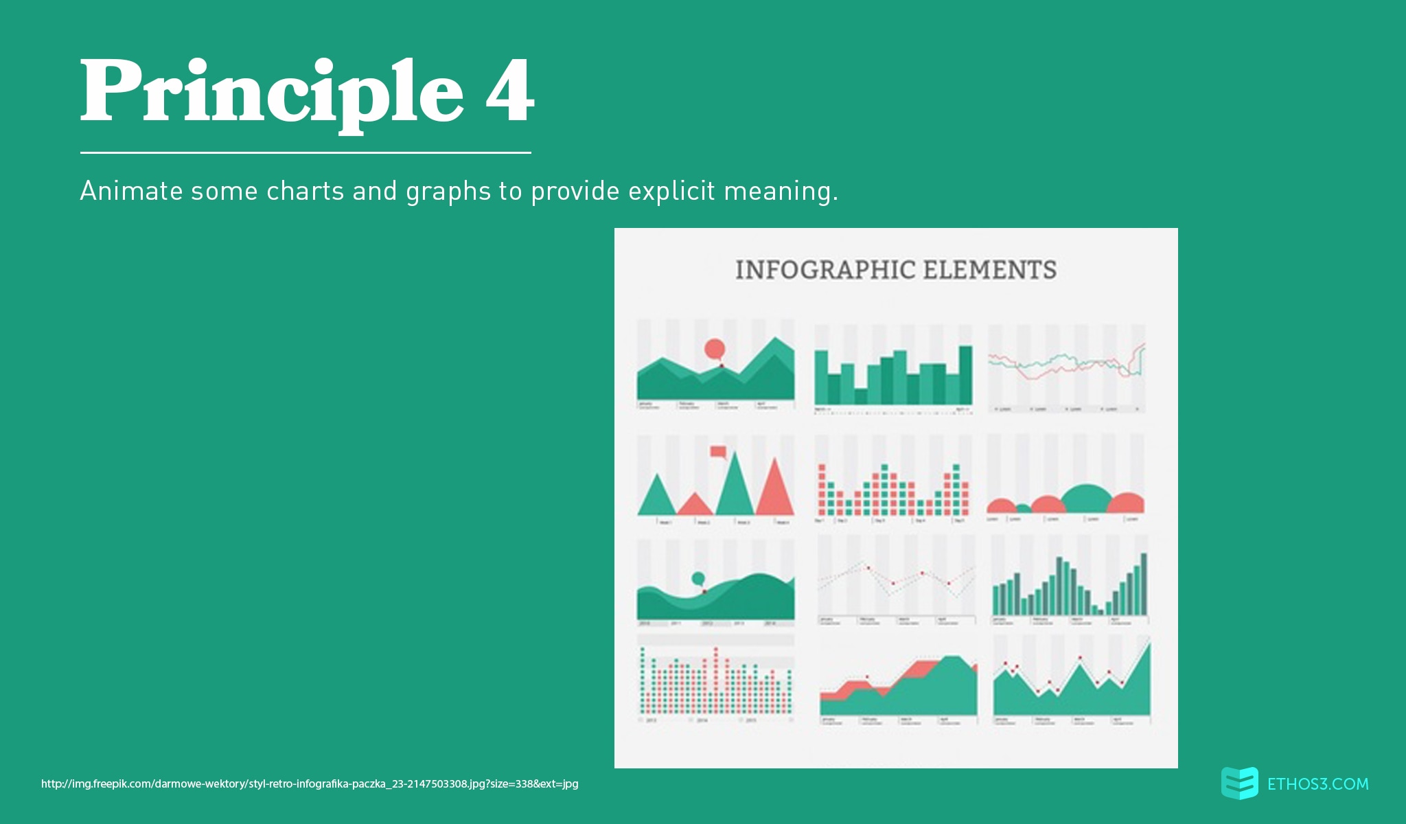
The charts and graphs presentation designers create for investor pitch decks are probably geared towards signifying growth or gaps in a market or industry. You will be strained for time during your pitch presentation. And your audience will not have the attention span or interest in navigating through data-heavy, busy slides. By using motion to display the primary point of a chart or graph, you short circuit the brain’s comprehension and processing framework – leading to an efficient delivery of your message.
Related Post: How to Master the Art of the Persuasive Sales Pitch

While every slide in your investor pitch decks should be given the royal presentation design treatment, your financial and team slides will undergo the most scrutiny. According to the DocSend study, investors typically spend the largest portion of their viewing time on the two slides. The financial and team slides also tend to be text-heavy. Let’s evaluate the crucial components of each individual slide.
For your financial slide, you’ll need to display your revenue (projected or otherwise), overall expenses, and profit. Many investor pitch decks cram all of this data on one slide. Presenters should consider breaking up the 3 sections of a typical financial slide into separate slides – introducing one element of the monetary landscape of your business at a time. You could even include a slide at the end of the financial succession to consolidate all of the previously-shown data. By keeping ideas limited to one per slide, you will allow your audience more time to comprehend the points.
For your team slide, you’ll need to include images and/or copy to highlight your team players. Refrain from typing every major accomplishment each team member has achieved in their entire lives. Simply place their photo, name, and title on the slide. You could even go one step further and nix the name and title – leaving only the images and relying on your speaking script to flesh out the additional details about your team.
Your investor pitch decks could be the deciding factor of whether your startup thrives or dies. Investing the effort and intentionality it requires to produce crisp and sophisticated design will be more than worth it for you and your team. For more insight into the elements of a great – and a not-so-great – pitch presentation, review posts from the Ethos3 archives.
4 Must-Have PowerPoint Template Slides for a Pitch Presentation
The Science of Successful Sales Presentations