Last month, Proctor & Gamble executives delivered a presentation to stakeholders at a conference. The consumer goods company has experienced declines in market share over the past two years. Through the presentation, however, representatives hoped to explain their plan to cut costs. Using a few of their slides – featured on The Motley Fool – we are going to discuss a few simple tips you can use in your investor presentation to communicate your message quicker.
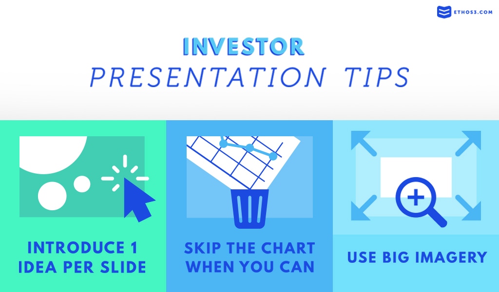
Introduce One Idea Per Slide
First, let’s take a look at this slide showing the transformation of Proctor & Gamble’s productivity over the past 4 years or so. In this slide, they are attempting to cover too much ground. We’ve got a bar graph focusing on the cost of goods savings, a line graph detailing enrollment, a chart listing out agency/production savings, and another chart demonstrating cumulative cash progress.
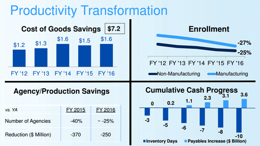
While all of these points are relevant to Productivity Transformation – as is the slide’s title – there is way too much going on here for any audience member to take in at one time. In your investor presentation, consider breaking up each of these 4 points or data representations into their own slides. This will allow your audience to effectively digest the information on the slide and avoid a horrible case of cognitive overload.
Skip the Chart When You Can
Now, we’ll analyze Proctor & Gamble’s slide on margin improvement. If you look at the chart on the slide, you’ll notice (after a minute or so of viewing) that the main point of it is that the core gross margin increased by 1.8% since FY ’13 and the core operating margin increased by 2.1% since FY ’13.
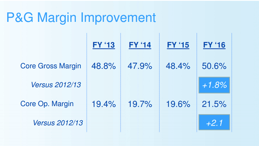
Since this presentation was given in person, the presenters could have simply showcased only these two numbers: +1.8% and +2.1%. Then, they could rely on their speaker’s notes to have the other information that is on the slide. This technique ensures that your audience will get the point quickly so that they can focus on you and your complementary speech.
Use Big Imagery
Finally, we’ll inspect this slide about brand awareness and trial sampling. The slide demonstrates how the company is trying to produce loyal customers in fabric care, grooming, baby care, and dish care.
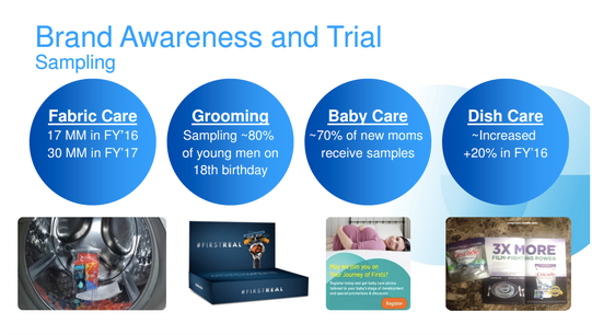
To improve the visual layout of this slide, we recommend breaking out 4 categories into their own unique slides. Then, utilize a relevant image as the main visual element for each of those slides with the corresponding text overlaid on top.