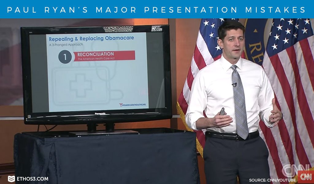
Last week, the Republican party’s plan to repeal and replace the Affordable Care Act dominated the news. But there was still a lot of confusion over what the new healthcare act would include, and if it would get enough votes to pass congress. So, House Speaker Paul Ryan gave a PowerPoint presentation on it, and broke every rule when it comes to giving a great presentation.
If you can make it through the entire 30 minutes, more power to you. But there just watching the first few minutes, I can spot glaring mistakes in how Mr. Ryan delivered his presentation. When it comes to knowing his content and providing his research, Ryan does well. But it’s the design and performance that really hurt his presentation, and social media had a field day with it. Here are some of Paul Ryan’s major presentation mistakes.

Reading Off the Slides:
Presenters should never read directly off their slides. Not only does this make the presenter sound repetitive for reading words that the audience can already see, it’s very boring for the audience as well. It also makes the presenter turn their back on the audience because they are looking at the screen instead of out into the crowd. Paul Ryan unfortunately does this throughout his entire presentation.
Here’s our 5 Reasons Why You Shouldn’t Read from Your Slides
Bullet Point Lists:
In an ultimate “death by PowerPoint” move, this presentation is filled with bullet points that are word heavy. There is research out there that shows audiences remember imagery much better than any bullet point list they’ve ever seen. Text should be minimal, and presenters should stick to one idea per slide.
Learn more on Why Bullet Points Kill Presentations
Pie Charts and Clip Art:
Another presentation killer is boring graphics. Too much text on a slide is one thing, but outdated clip art and pointless pie charts really lack creativity and aesthetic. Representing data is a pie chart is not memorable. Try creating a visual representation of the data with recognizable items. There is plenty of great stock photography and illustrations that you can buy offline instead of relying on clip art. Design is a key ingredient to an impactful presentation.
Follow these 3 Simple Tips for Creative Data Visualization
Paul Ryan scored high in preparation and content, but his presentation was missing key design elements. His delivery also needed improvement to better establish his expertise and credibility. So, take this as a learning experience for what not to do on your next presentation.
Related Posts:
A Simple Alternative to Bullet Points