The human eye is a fragile and powerful structure. One eye is stitched to the brain by over 1 million nerves. The visuals we view comprise 80% of the memories we retain. For presenters, a comprehensive understanding of the ways in which the eye works and how it moves across a page, image, or slide is important to the success of your presentation design. Below, we’ve outlined some tips for presenters to maximize the imagery in your deck and the information your audience remembers.
1. Informational text, first
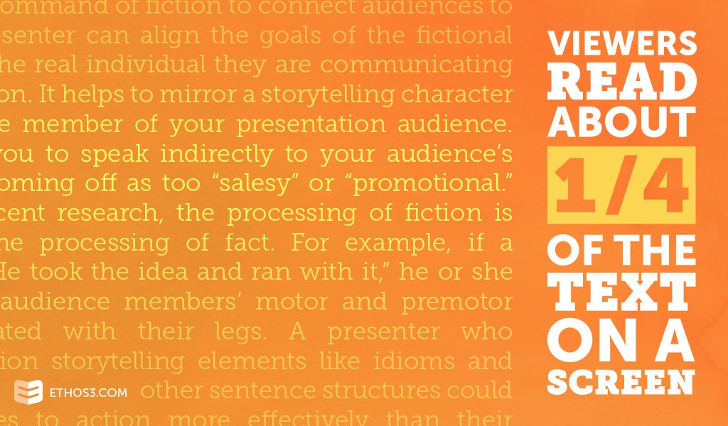
Just as a journalist is taught to write in the manner of an inverted pyramid – most important information at the top of the article, least important information at the end, a presenter must learn to do the same on each slide. This notion is backed by a 2006 eye tracking study of webpage users, who were found to scan screens in an F-shaped pattern. The study concluded that the F-shaped pattern is a detriment to website creators – who should keep in mind the words they put at the top of a page. Highlight the content that you want your audience to remember on the far left side of a slide to increase the chances of it being read. Utilize pointed and direct headings and subheadings. If an audience member could read the first few words and digest the purpose of the content, you are golden.
Presentation Tip:
Will your presentation need to include text-heavy slides? Put Gutenberg’s diagram to action. Crucial points in the top-left section of the slide. Somewhat less important information in the top-right section of the slide. And least necessary messages in the bottom-left and bottom-right areas.
2.Place emphasis on action
Many of the decks we come across at Ethos3 suffer from what I like to call “slide anchoring.” This occurs when a presenter can’t decide what the primary point of a particular slide is, and thus, decides to place all of the points he or she can think of into the limited space. Presenters who do this weigh down their slide visually and devalue their message. Now, you’ve got slides with way too much text, way too many visuals, and – worst of all – an inconsistent narrative and incomprehensible message.
Presentation Tip:
Instead, aim to craft an engaging narrative direction using the least amount of text as possible. Tell your audience the additional details that may not be conveyed by a certain slide. And utilize that precious slide space to emphasize data and information that will incite action from listeners. For example, consider inserting subtle animation to introduce a relevant resource or helpful tool. Your audience members will benefit from the valuable tip and advice. You’ll benefit from the credibility and reliability that the emphasis on action created among those in the seats in front of you. Eventually, this could lead to more business for your company or brand.
3. Incorporate photos with faces
Are you one of those people who takes a few looks in the mirror before heading into work every morning? Aren’t we all? It’s no problem, really. In fact, it’s part of our biological make-up to resonate with our own faces, as well as others. One study showed that people – both men and women – tend to divert their attention directly to faces in images of another person or other people. Humans have mirror neurons that react to facial features and expressions – oftentimes mimicking the activity we see.
Presentation Tip:
When appropriate, use images with human faces in them. It will make your content more relatable and relevant to your audience.
If you are struggling with starting your presentation design, use these 3 tips as guides to structuring the visual and textual elements of your deck. Mastering the methods for motivating the eye movement of audience members is a great beginning point and a solid foundation for the rest of your deck. For more advice on enhancing the quality of your presentation, check out the following articles:
Why You Need to Think About Eye Tracking
Should You Use Scripts in Your Presentation Design?
Applying Texture in Your Presentation Design