Most companies have developed a list of core values that encompass the way they think about their work, clients, team, and themselves. These are often tacked on cork board and hung on walls like a decree, posted as a reminder to employees and guests that may come to visit.
We wanted to do something a little more fun than just an internal piece that could gather dust for our core values. After brainstorming, our team came up with the creative concept of a short video that could be posted on social media channels to run through each of the 10 values. The video used iconography and animation to make each statement “pop,” and also help our potential clients get a better understanding of who we are.
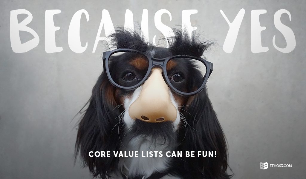
Because yes, core value lists can be fun!
Check out the finished product below, and then read on to find some inspiration for your own core values:
Before we started to develop the video, we knew that content needed to be trimmed down from a sentence per value to a few words (around three) that would be animated clearly. Pull up your current list of core values: how can you edit down long sentences, maybe even paragraphs, to say what you want to say in a succinct way?
Simplify, Simplify
If your content is cumbersome, aim for a single line. An example would be our “Do The Ordinary Extraordinarily Well: Create WOW experiences by doing ordinary things in ways no one will ever expect.” It’s long enough to give a little extra context to the initial statement after the punctuation and still has the strength to motivate.
Next, our focus was to keep the design of the video aligned with brand colors and our overall “look.” We used flat illustration, fun typography, and bright accent colors to make the video eye-catching and fun. The animation also helped carry the viewers’ eyes from one of the core values to the next.
Typography is Key
If you want to capture some of this design mojo in a presentation or motion piece, play with different styles of typography and brand colors to transform your edited content into something frame-worthy. Since text is the focus, keep things simple by emphasizing the words themselves through large fonts, different styles, and placement. As you can see with our piece, typography takes the center stage and animates for context. Even without animation, the core values stand out as their own image.
With a little bit of editing and some creativity, even a lengthy list of core values can become something frame-worthy and memorable.
Want to learn more tips from some of our best past projects? Check out these related articles:
Inside Ethos3: Using Content Pitches to Develop a Strong Storyboard
Building a Viral Infographic: The Story Behind “We Live in a Visual World”
Inspiration From Everywhere: The Story of Our Nashville Deck

