The humble agenda slide: it appears in almost every presentation that comes through our doors, and yet is given so little love. It serves such a straightforward purpose that it’s hard for most to understand why it needs refinement. And while we don’t blame you, we also believe that an agenda slide is a great place to set the tone for your presentation and add to the overall experience.
Let’s start with the reason an agenda slide exists: to let your audience know what to expect during your presentation by reviewing the key sections. Why not spend this time to get them excited about the talk itself?
Tip #1: Trim to the Essentials
Don’t reveal too much in the text of each section header. For example, if you are going to talk about “Strategic Annual Marketing Initiatives,” cut that down to something more manageable like “Marketing Initiatives.” You can fill in gaps when you get to that particular section; no one is going to be sitting on the edge of their conference chair while they wait.
Tip #2: Combine Sections Where Possible
While we prefer to use three key sections in a presentation for the sake of your audience’s memory, sometimes the content calls for more. Always try to combine sections or minimize the number of agenda points; the more there are, the more your audience will worry about the length of the talk or forget which section comes next as you run through it. Don’t overwhelm your audience with 15 sections when it can be trimmed to a neat 5.
Tip #3: Keep Design In Tact
The agenda slide doesn’t just set the content tone, it also previews the design for the rest of the presentation. Don’t neglect the look of the slide by putting the text on a plain, single color background. Consider using photography with the agenda text resting in the open space, or other design elements like lines and icons complementing the text. No agenda slide needs to be an eyesore.
Tip #4: Improve the Header
Everyone knows an agenda slide when they see one. So why not have fun with the header text? Consider something more conversational, such as “Let’s Discuss” or “Let’s Talk About.” You could also use text that works with the main theme. For example, if you have a plant/growth metaphor, you might title your agenda slide “Planting the Seeds.”
What could a great agenda slide layout look like? Here’s an example with a little creativity and editing:
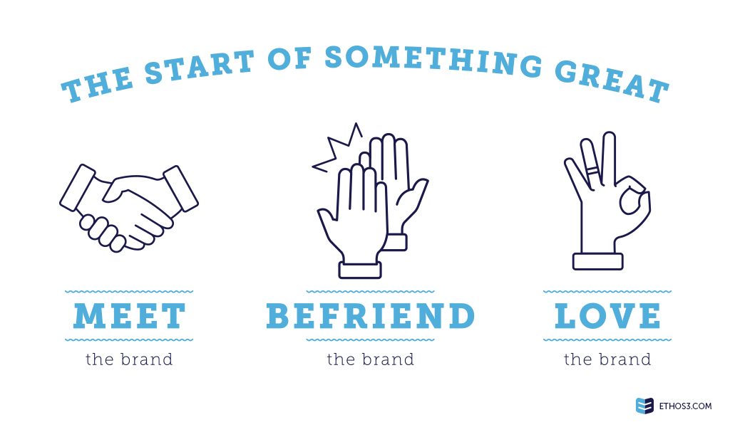
It’s simple, catchy, and fun. The audience can expect that they will be educated and perhaps face a call-to-action in the “love the brand” section, but otherwise, this agenda slide is a far cry from the norm.
Want to learn more about how you can develop great slides throughout your presentation? Check out these related articles from our archives!
Why Your “About Us” Slide Needs to Move
Why Bullet Points Kill Presentations
Inside Ethos3: Using Content Pitches to Develop a Strong Storyboard

