So, you need to create a gorgeous, shareable, and professional presentation. Your brand has some loose guidelines, maybe even just a logo, but you’d like to find a PowerPoint template that fits your general style. And finally, the color palette you choose will be reflected in other assets that stem from this original presentation. Sound familiar?
If you’re feeling lost, let’s start with the basics. We’ll give you a few general palette design rules, followed by some great resources to find inspiration. By the time you’re done with this article, you should have enough info to get started and find a template that fits your needs and style.
A few fast rules to start:
1. You don’t want to have a single color throughout your deck, nor do you want so many colors that design feels sporadic. As a rule, your palette shouldn’t exceed more than five colors. This will give you enough freedom to create unique slides that stand apart, but match the overall feel.
2. The bulk of your selected colors should fit within the warm (reds, oranges, yellows) or cool (blues, greens, purples) family. Your accent colors should stand apart and fall outside of the main group, enough to differentiate itself on each slide.
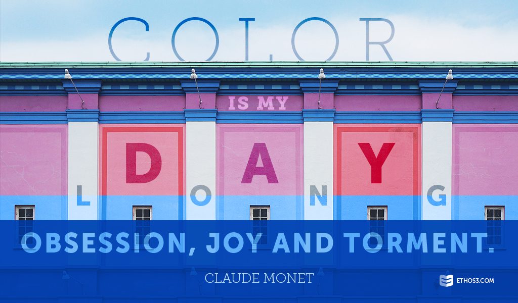
3. Make sure all of the colors you pick are friendly on the eyes and friendly on the screen you will be projecting onto. Test the palette by putting it up as a projection and sitting in the back of the room to view it. Is it easy to look at? Or is it so bright that it gives you a headache? Make your choice accordingly.
Resources you’ll love:
Want to see what a great palette looks like? Follow these handy links to get inspiration and use tools that can help you mix and match something beautiful.
50 Beautiful Color Palettes for Your Next Web Project from Digital Telepathy
The Color Scheme Designer by Paletton
The super fast color schemes generator! by Coolors
Explore Over a Million Color Palettes by ColourLovers
Color palette inspirations from Pinterest
What if you want to change an existing color palette in a template?
If you already have a presentation template within PowerPoint that your company is using and you want to give it a design refresh, never fear! Dummies.com has created a handy, step-by-step guide to walk you through the process. This is a great tool if you are rebranding, but also if you are looking to use existing assets in a fun new way without spending a lot of design dollars.
Without further ado, here is your complete guide to “How to create a color scheme in PowerPoint.”
The colors you choose for your PowerPoint template should highlight, and not detract from, the best parts of your content. Whether it’s video, text, or photography, you need to choose a range of colors that will look great once everything is brought together. Think simple, but not dull. Leave your best color choice to become an accent color, and let the bulk of your palette be flattering and clear.
Want to learn more tactics and techniques for your PowerPoint design? Check out these related articles from our archives:
The History of Color Psychology
