So, you have a beautiful PowerPoint template downloaded onto your computer, and it’s ready to be filled with content, images, and logos. How can you ensure each of your elements will come together smoothly? How do you maintain the beauty of the empty template without messing everything up?
We talked to one of our designers at Ethos3 to gain some wisdom about template best practices. Our question was simple: “what are the most important things for template users to know before they start working on design?”
Here’s what they had to say.
Template Migration
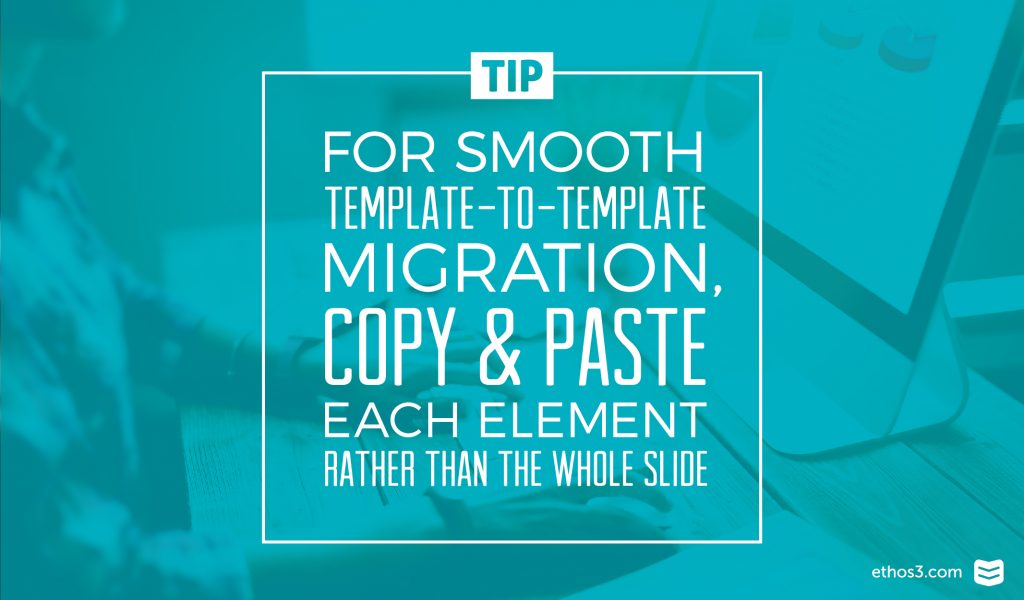
It’s common for template users to create a Frankenstein deck of different slides from different templates and presentations. Maybe they want to use content from an old sales deck along with a newer pitch deck for a new product. However, our designers warn that you will run into formatting trouble if you try to drag entire slides from one template to another. Each of the conflicting formats can cause squishing, stretching, or other unpleasant errors.
In order to avoid this trouble, you need to copy and paste each individual object from one presentation into the other presentation. While this is a little more time consuming, it is definitely the cleanest way to migrate elements and keep your design tidy.
Layout Use
Many template users try to “transform” an existing slide layout to accommodate different kinds of content. Let’s say you have a bullet point slide, but what you really need is a team slide with photos and text below each image. A lot is lost in translation when a layout is forced into a different usage, and sometimes the slide turns out more uneven and unnatural looking than if it had been designed from a blank slide.
Our designer recommends that you always try to use existing layouts without forcing the content. If you can’t find the layout that you need, perhaps another kind of template is in order.
Image Do’s and Don’ts
Old habits die hard! When you’re looking for the perfect photo, you may be tempted to search through Google and download something fast. This can be a problem for a few reasons, mainly because it’s illegal to use images you don’t have right to use. But also, many of those images aren’t high resolution enough to look good inside of your presentation or on a fullscreen when you present.
Our design team recommends that you wither invest in high-quality stock photography or take your own photos. You’ll be much happier with the results, and you won’t have to lose sleep at night by worrying about being sued.
Color Schemes
Templates are mindfully built with color schemes that have been hand-selected by the designer to look beautiful. These color schemes are meant to stay together in order to give the presentation consistency, and help each slide match the one before it.
While your photos may include a rainbow of different shades, try to keep within the set color schemes even if you are combining a mixture of past content and design elements. Trust the designer’s keen eye, or you may be at risk of compromising the look and feel. If you do stray and add some different colors, be wary of their relationship to the existing set.
Want to learn more tips and tricks about PowerPoint templates to help boost usability and design? Check out these articles from our archives for more info!
3 Ways to Use Presentation Templates to Your Advantage