We’re experiencing a huge change every day, happening right in our pockets. In 2014, 1.5 billion smartphones were sold as opposed to 300 million PC units. We carry our lives in these tiny, powerful pocket computers. By 2020, it is estimated that 5 billion people will own a smartphone; more than half of the entire population of the planet.
The mobile shift isn’t about to happen, it’s happening right now. What are you changing about your business to accommodate it?
Start with your existing presentations.
If PC units are becoming clunky and old fashioned, then presenting on mobile devices wherever and whenever will soon become a staple. From sales decks to demos to catalogs of products, there are so many instances a presentation can be used in an impromptu situation. This will only become more imperative as we creep towards that 2020 estimation, when people will expect the same level of functionality from a smartphone as they do their full PC.
If you have presentations that exist in your backlog and need to update them, we have a few fast tips that can help you get started converting them today.
From the desktop to the smartphone.
Presentations can be shared in the cloud using a service like PowerPoint online so that they won’t take up a ton of storage on the smartphone device. You might also consider using a free online service like Google Slides, which give your users the power of collaboration and minimize storage with the Google cloud. The goal with these programs is easy access without the downside of file storage.
What if you have demo videos and other heavy assets that simply won’t work in the cloud? Consider using Youtube to host your videos, and then set your channel to private. No bulky storage, no fuss; all you need is a URL.
Make it big.
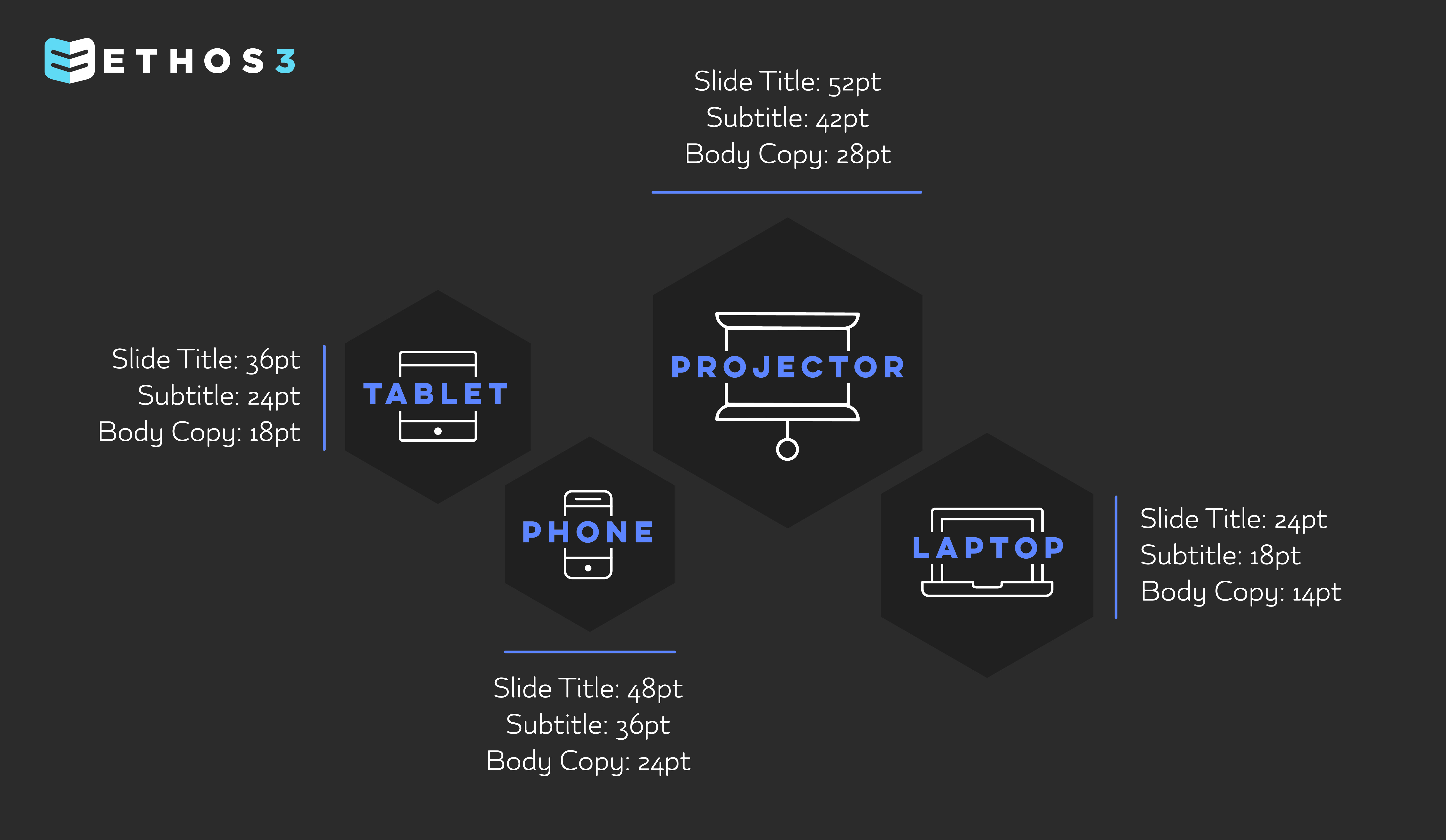
As for the design and functionality of your existing presentations, you are going to need to make both images and the text much, much bigger to accommodate smartphone needs. Small font looks like specks of dust on a screen, and photos may appear distorted. Complicated graphics can also become a problem, so stick with simple shapes and images that won’t look strange when reduced in size.
Here’s a fast guide to font size for all of your many devices:
As for the size of your deck, you might be familiar with the 4:3 ratio (a square shape) or 16:9 (a widescreen shape). We recommend using widescreen, 16:9, so that you can turn the screen of your phone sideways and flip through the deck. The image will then fully fill your screen without any black space.
Most presentation editing software for a mobile device will be limited in their ability to edit and design your content. For now, we recommend simplifying images and illustrations on your desktop, then uploading to the cloud when you’re finished.
Smartphones are considered to be the first true universal tech product, with a place in every business, every home, and every pocket. Stay on top of this shift by creating mobile friendly versions of your existing presentations to start, with the goal of making your next big deck optimized right out of the gate. Don’t be left behind!