It seems like every time I scroll through my social media newsfeeds, I come across at least one article extolling the power of big data. Have you also noticed a surge of content on the topic of big data? If so, you have likely noticed that even though there is significant chatter about big data, there is also a surprising lack of insight into the best practices for presenting data to the masses.
Because of this void in the conversation on data, I want to share with you some best practices for communicating data visually.
Whether your data falls into the “big data” niche, or fits into another category of data, you can easily follow these data visualization techniques for sharing your data with your audience.
In addition, you can easily use these techniques across various visual formats, including infographics, videos, and of course – presentations.
So, without further ado, let’s jump into the tips.
Here are 3 tips for effectively presenting data:
1. Get real with your data.
Banish bar graphs and pie charts from your repertoire; never use cliché charts and graphs again. I know basic charts and graphs are a breeze to design, and therefore tempting to use, but just say “no” to the temptation.
Most people have been exposed to the traditional chart and graph styles since elementary school. Thus, these tired data visualization formats are easily forgotten and ignored by audiences. No matter how you slice it, common chart and graph formats are not effective.
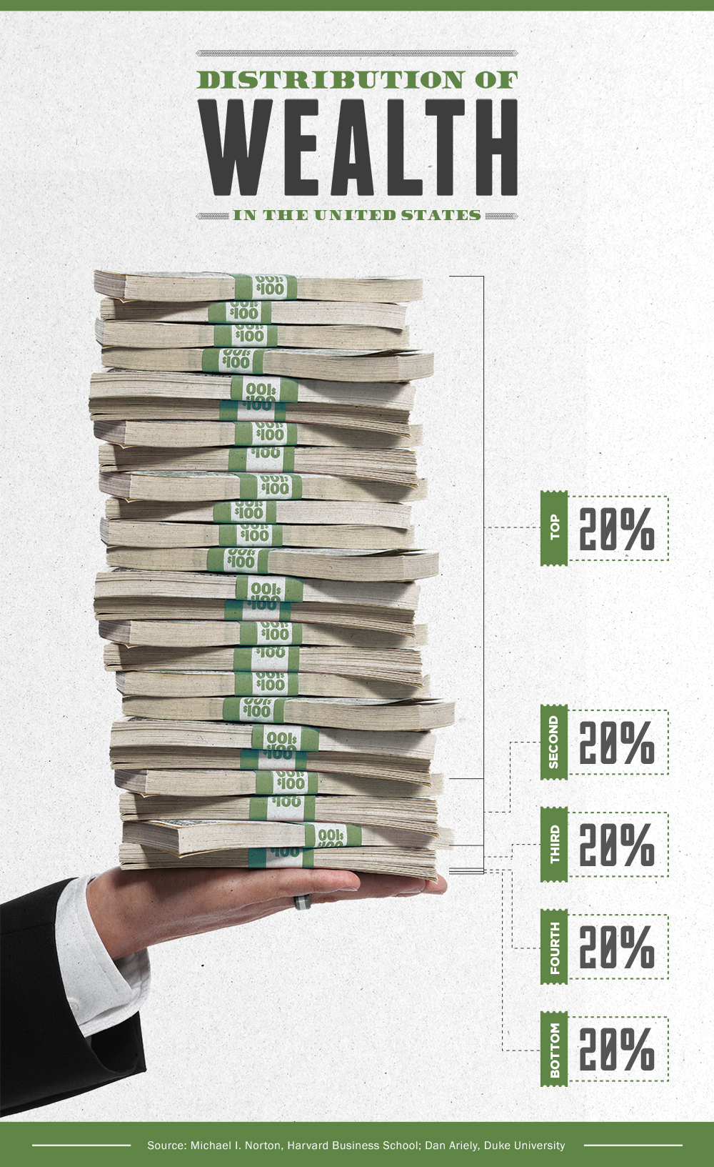
To keep your data from being dismissed, base your data visualizations on objects that will be easily recognizable by your audience. People respond better to visualizations consisting of recognizable objects. Remember to include items that are related to the topic covered in the data you are presenting. For example, if you’re talking about economic disparity between the rich and poor, two stacks of cash will be more meaningful and memorable, compared to a bar chart, or a list of numbers.
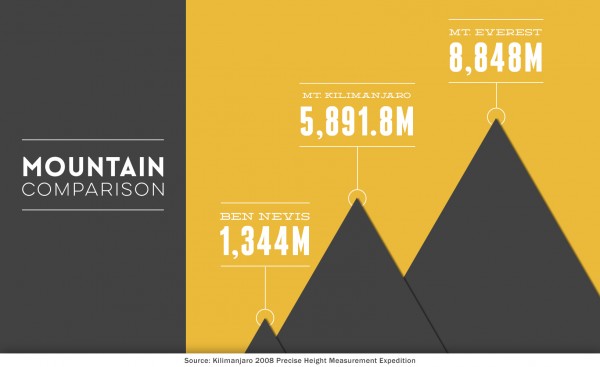
2. Use scale to tell a story.
If you want to demonstrate the difference between various points in your data, design your visuals as close to scale as possible. Visually comparing the data points will make your data easier to comprehend, especially if your numbers are above and beyond what most humans can easily count or imagine.
In addition, leverage the advice above when you visualize ratios in your data points. As shown in the example below, by using relevant, recognizable visuals in conjunction with proper scale, data visualization can tell a complete story that is easy to quickly comprehend.
3. Add meaning with metaphors.
Big data often describes abstract concepts. Help your audience better understand your abstract data points by using images metaphorically. This creative approach to abstract data can add meaning to your message by grounding your data in the physical world.
Develop your metaphor by drawing inspiration from the overall topic as well as the specific conclusions of your data analysis. As you can see in the example below, with a metaphorical visualization of your data, you have the option to ditch numbers altogether, and instead display only your conclusions.
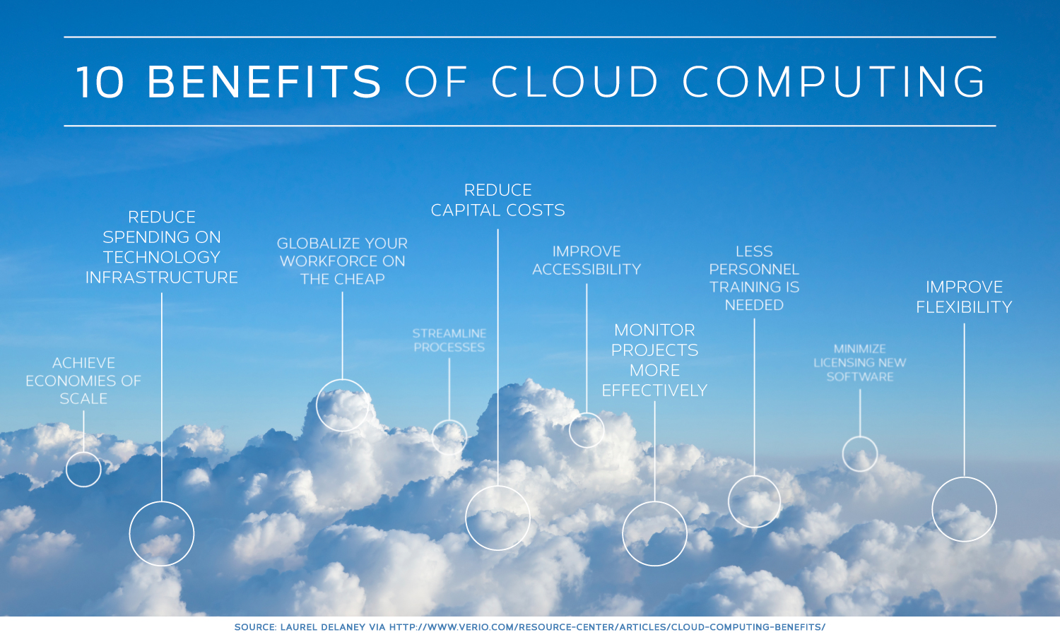 Even though “cloud computing” has nothing to do with weather, or clouds in the sky, the image of clouds gives viewers a recognizable object to associate with your message. The familiar image serves as an anchor that will help your message stick in your audience members’ memories.
Conclusion: Creative data visualization is as easy as following the tips above. Thus, there is no excuse for trotting out tired design techniques to communicate your data. No matter how you decide to visualize your data, pie charts and bar graphs should be avoided at all costs to ensure that your data is memorable and meaningful.