This SlideShare deck, designed last summer by a former intern at Ethos3, serves as a good example of how to include a lot of words in a presentation. Though it’s not our typical method of presentation design, it’s inevitable that you’ll run into cases where it’s necessary to include a significant amount of text on each slide. “How to Use Color Wisely” shows that it’s possible to do so while maintaining a beautiful design.
First things first: it’s apt to point out that this deck was derived from an already written blog post. (Quick tip: Don’t limit yourself to keeping content in one form, but rather think of ways to turn that content into more content, i.e. blog posts into SlideShare decks.) To turn that blog post into a deck, our content writer simply went through the blog post highlighting sentences and assigning each a slide number. Our intern then worked from that document to create this compelling SlideShare deck.
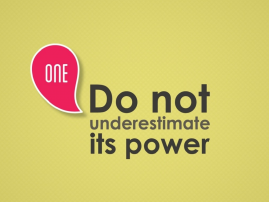
As we’ve mentioned before in our “Learn by Example” series, it’s crucial to break up your content into objectives. We favor breaking content up into threes, but really any number will do (i.e. 5 Quick Tips, 3 Key Takeaways, 4 Quotes, etc.) as long as it’s broken up in an intuitive way. Always design these objective slides in a similar way, as you see in the slide below.
We must admit our one qualm with the design of this deck is that it would have benefitted from a higher level of consistency. Our intern used lots of different styles, and though some sections are more consistent than others, many slides differ rather significantly.
With that said, there’s an effective use of contrast throughout the deck, which is intuitive as the topic of the deck is color. Our intern did a great job contrasting color with black and white throughout– a design element that fits well with the content as a whole.
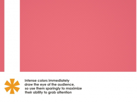
Lastly, let’s take a look at slide 24:
This slide is a wonderful example of design aiding and supporting content. It’s an ideal example of the “show, don’t tell” principle. The slide’s takeaway is that intense colors draw the eye’s attention– an observation that our designer shows by placing a tiny bright orange asterisk in the bottom left color, thus drawing the viewer’s eye immediately. Encourage that kind of play between design and content. Though it’s subtle, it makes a lasting impression and teaches a lesson by showing rather than telling.


