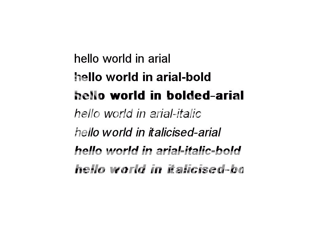
If you use any Microsoft Office program, you have probably stumbled across the Arial font. No worries. It’s not a bad thing, just don’t abuse the font in your next presentation. It is used way too much.
Here is a brief history lesson from Mark Simonson about the font:
“Arial has spread like a virus through the typographic landscape and illustrates the pervasiveness of Microsoft’s influence in the world. Arial’s ubiquity is not due to its beauty. It’s actually rather homely. Not that homeliness is necessarily a bad thing for a typeface. With typefaces, character and history are just as important. Arial, however, has a rather dubious history and not much character. In fact, Arial is little more than a shameless impostor.
When Microsoft made TrueType the standard font format for Windows 3.1, they opted to go with Arial rather than Helvetica, probably because it was cheaper and they knew most people wouldn’t know (or even care about) the difference. Apple also standardized on TrueType at the same time, but went with Helvetica, not Arial, and paid Linotype’s license fee. Of course, Windows 3.1 was a big hit. Thus, Arial is now everywhere, a side effect of Windows’ success, born out of the desire to avoid paying license fees.”
That is probably more information than you wanted to know, but as you can tell the font has an interesting history. It may make you think twice about the font the next time you open PowerPoint.
