You are probably not a professional presentation designer, however if you are like most professionals, your career likely requires you to create high-quality presentations for events like conferences, pitches, meetings, and webinars.
We sympathize with you and any professional who is assigned the daunting task of creating a presentation that looks like it was designed by professional designers, without any actual help from professional designers. That sounds stressful and like a recipe for less than ideal results.
That is why we occasionally reveal our presentation design secrets via behind-the-scenes access to our presentation design process. We are here to help you and other professionals survive the challenge of creating presentations that will impress your boss and colleagues. We want to help you create presentations that will move you closer to the next level of success you desire and deserve.
To give you a sneak peek into the mind of our professional design team, I want to share with you a few slides that we redesigned for Courtney Seiter, a friend of mine and one of the brilliant Content Crafters on the Buffer team.
Courtney gives a lot of presentations and is actually quite skilled at putting together impactful slides. (Good job, Courtney!)
However since Courtney is not a professional presentation designer, her slides can still be improved with a little help from the Ethos3 presentation design team.
Check out Courtney’s original slides, and then review the Ethos3 versions of her slides, accompanied by notes from the Ethos3 presentation design team.
The next time you need to design a presentation, review these before and after examples to inspire you to enhance your slides by thinking like a professional presentation designer.
Original Slide:
Ethos3 version:

Presentation Designer Notes:
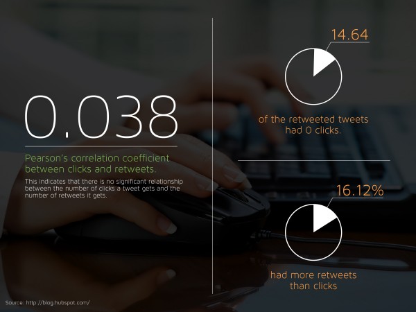
By adding a darkened image of beakers, we visually connect the viewer to the idea of science, which is part of theme of the presentation, The Science of Writing Must-Click Headlines on Social Media. The addition of the science-themed icon adds develops that connection even further.
By using a thin, minimalistic font, we elevate the overall style of the slide to modern design standards. Even though the text is minimal in regards to style as well as character count, the message still stands out and is easy to read against the dark, moody background.
This combination of professional photography and sophisticated typography results in a cover slide that says this information must be so important that someone took the time to make it look good.
Original Slide:
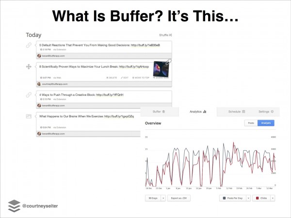
Ethos3 version:
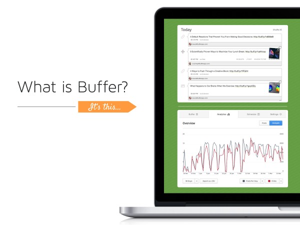
Presentation Designer Notes:
In the original slide, the screenshots were floating on the slide, with no context. By placing the screenshot in an image of a laptop, we give the screenshots much-needed context. This context helps to answer the question: What is Buffer?
The laptop helps viewers immediately understand that Buffer is part of an app that can be accessed via their laptop, and other devices connected to the internet.
On this slide and subsequent slides, we used the same green that we used for the icon on the cover slide as well as the same font so the deck has a consistent style throughout. In addition, we introduced a new color with the orange arrow. This accent orange color is a fun little surprise that still fits within the look of the other slides. When designing slides, you want to maintain a consistent color scheme, but you also don’t want your slides to be so predictable that your viewers get bored.
Original Slide:
Ethos3 version:
Presentation Designer Notes:
The original slide was nicely designed in that it was simple and easy to read, however the design was not interesting to view. By taking a little time to select a photo and add a dark overlay to the image, the slide is now more exciting to review.
Since the image features a person using a keyboard and mouse, the photo also adds an extra layer of meaning to the slide. The photo reminds viewers that Buffer is a tool for online productivity.
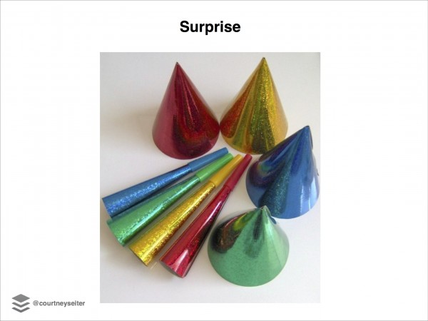
Original Slide:
Ethos3 version:

Presentation Designer Notes:
The original slide needed to be redesigned for a few reasons.
For example, the image did not fill the entire slide, nor was it placed on the slide in accordance with The Rule of Thirds.
In addition, while we can safely assume that the hats and party favors were meant to convey the idea of a surprise party, the photo did not tell a story or spark any emotional response.
The stock photo used in the revised slide is an upgrade from the original image because it has a sense of narrative and effectively conveys the feeling of surprise.
When selecting stock images for your slides, be a bit of a photography snob and only use images that are creative and unexpected, but also relevant to your message. Your photos should have a sense of story and also be thoughtfully composed. Use your photos to hook the attention of your audience, not just to fill space on a white slide.
Conclusion:
Presentation design is not easy. We know that most professionals do not have the time, resources, or skills to create presentations that match the quality of presentations produced by professional designers.
However since presentations can have an enormous impact on your career, we hope you will take inspiration from the tips above and invest some extra time to create presentations that are interesting for your audience to view. You can do it! We believe in you. And if you need a little help, contact us. We are here for you.
Additional Resources:
Slide Makeovers: Buffer’s Social Media Guide
Gorgeous (And Free) Stock Photos For Your Presentations
