Most people do not get giddy with excitement when tasked with the responsibility of designing a Powerpoint presentation.
Some people might relish the spotlight, and therefore welcome any opportunity to deliver a presentation.
Others might enjoy the process of developing the perfect flow and tone for the presentation message.
However, very few people seem to celebrate the tedious process of presentation design.
I believe presentation design is an underappreciated art form because it is difficult.
Many people are experienced speakers and writers, however not many people have the opportunity to refine their presentation design skills, thus presentation design is challenging and time consuming.
If you are someone who dreads opening Powerpoint to start crafting slides for a presentation, I suggest you open your mind to a new perspective, and embrace the joy of presentation design. Presentation design can be fun, as well as rewarding. If you look at presentation design with a lens of positivity and joy, you might be surprised what you can create.
If you have to do it anyways, why not enjoy it? That’s my philosophy.
If you agree, the presentation design tips included below are for you!
Before your next presentation be sure to review these 3 tips so you can enjoy the process of designing your slides.
1. Adjust Your Perspective
For these 3 tips, I want to reference the Ethos3 presentation, All About Beer.
With 589,532 on Slideshare, it is safe to declare this presentation a success.
You might think it is an unfair advantage to select a presentation about beer for the sample piece for this blog post. Perhaps you are thinking, Of course a presentation about beer is fun!
While it is true that beer is a more interesting topic than some others, you should also note that this presentation is not made of beer; you will not get a fun buzz from viewing the slides. This presentation covers relatively bland facts about beer, such as the process of beer-making, the ingredients for beer, and some historical facts about the beloved beverage.
What makes this presentation fun is not the topic itself but rather the approach to the topic.
Instead of simply listing the steps for beer-making, and a few facts about beer, this topic is approached with a lighthearted perspective.
For example, instead of just launching into the tactical material, the presentation starts with an arguably unnecessary, but valuable slide.
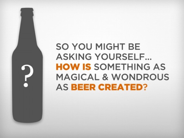
This jovial slide is valuable because it communicates a specific perspective to the audience; it says, I had fun creating this presentation, and you are going to have fun viewing it.
Specifically, the word choice on this slide communicates the unique perspective on the topic. Words such as magical and wondrous scream: I am not your typical Powerpoint presentation!
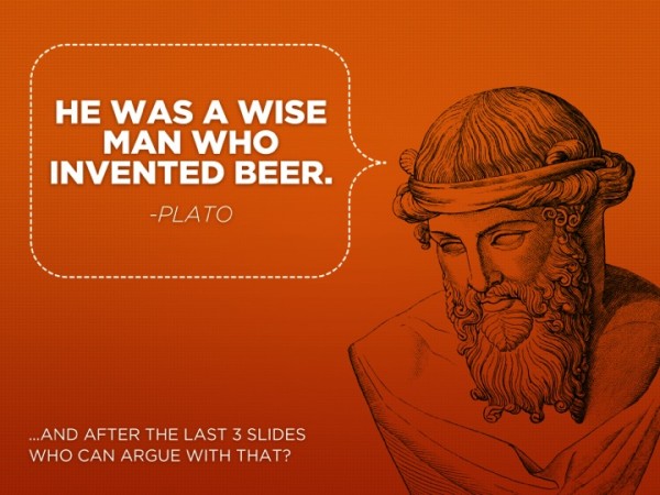
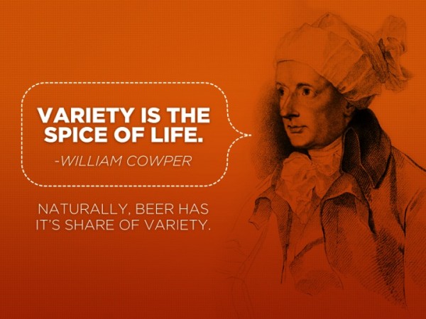
In addition, to infuse the somewhat boring facts and how-to information with an element of playfulness, fun quotes were inserted into the presentation deck.
Again, these slides could be considered unnecessary, however the presentation would not be the same without these additions.
2. Be Colorful
Professional presentations don’t need to look corporate or be predictable to be taken seriously. Thus, avoid the common presentation design trap of creating a presentation that is simply a repetitive string of slides with white backgrounds. You can do better than that!
In addition to backgrounds, you can also utilize colors for image overlays, icons, and other supporting design elements.
Some brands have strict style guides, and therefore many presenters do not have the freedom to utilize their preferred colors for their professional presentations. However, if you have any wiggle room in your brand style guide, take the creative license and run with it. Be as inventive as possible, without going overboard.
If you can select any colors you wish, choose colors that your target audience will respect as well as enjoy. If you create high-quality slides, and select your design elements with great care and consideration, you can successfully experiment with unexpected colors as a way to intrigue your audience.
The first step to selecting a color palette for your presentation design is research. Know your audience, and their preferences. Also, understand the cultural significance of colors, as the meaning and impact of colors varies across demographics and cultures.
As you can see in All About Beer, you can easily upgrade a flat, white background by adding a light texture and a hint of color. If you mix slides that have almost-white backgrounds with even more colorful slides, your audience will be more likely to stay interested in your presentation.


Looking at example slides from the All About Beer presentation, I am energized by the orange slides. For many people, orange resonates as a fun and playful color. Since orange is also reminiscent of the color of many beers, this playful, energizing color was a perfect fit for the presentation.
While orange might be an obvious color to use in hindsight, many presenters would have instead opted for slides with white backgrounds.
As I stated earlier, force yourself to say no to slides with white backgrounds as much as possible, unless you have an important reason to make that design decision.
To create colorful slides that also add meaning to your message, think of colors that relate to your topic. Then, reference your color research to ensure your chosen colors are an ideal fit for the personalities and cultural heritages of the audience.
Remember: You want your presentation to be a pleasurable experience for the audience, and color is a critical part of the presentation experience.
Check out this Ethos3 motion video for a quick insight into the power of colors for presentations and marketing designs:
3. Show Your Style
If you want your audience to enjoy your presentation, you need to select a presentation design style that goes above and beyond the typical Death By PowerPoint style.
Death By PowerPoint presentations are usually riddled with standardized bullet point lists, stock images that look outdated, and an excessive amount of information on the slides.
To ensure your presentation is fun, and not a drag, edit your content until you are only presenting only the critical points. Excess content can drain your audience of energy, and leave them feeling overwhelmed. Since you don’t want your presentation to frustrate the audience, do the heavy-lifting for them and present a message that is easy to digest.
In addition, if you must use bullet points to display multiple ideas on one slide, please don’t use the bullet points provided in PowerPoint.
Since you can purchase icons and illustrations from most stock photography sites, I suggest you purchase some bullet point alternatives to spice up your slides, or create your own bullet point solutions.
Conclusion
The next time you sit down to open blank PowerPoint slides, turn on some music, put a smile on your face, and remember to enjoy yourself. Presentation design is an art form, and you are creating a masterpiece that represents your expertise. If you dread designing your slides, your lack of enthusiasm will likely be evident in the final product.
Use colors, content, and overall style to express your excitement for speaking to the audience. Your audience will appreciate the extra effort you invested to create an enjoyable presentation.