If you have outdated or ineffective presentations uploaded to Slideshare or other sites, you should consider giving your slides a new life with a presentation design makeover. Whether you like it or not, some people will evaluate your professional credibility by reviewing your presentations online. If the style of your presentation is a throwback to 1999, some people might assume that your expertise is equally old-school, and not in a good way. Sad, but true.
To inspire you to give your presentations a fresh new look, check out the presentation makeover created by the Ethos3 presentation designers for bestselling author Bernard Marr.
As you can see in the presentation featured above, Mr. Marr’s original slides had many positive elements, especially the informative content presented on the slides. While we applaud the immense value of the presentation, we also wanted to see what the slides would like with a more modern design approach.
Toss The Stock
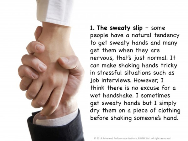
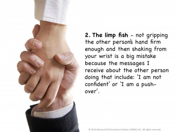
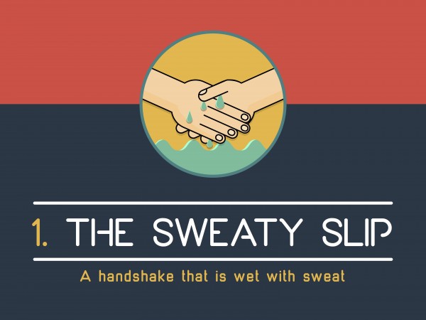
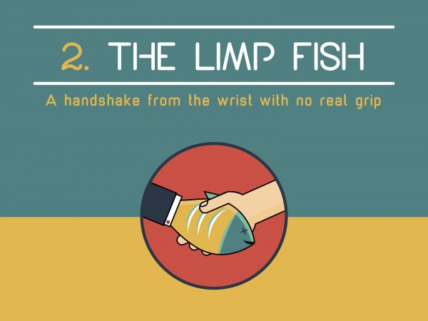
In lieu of stock photography, we opted for flat illustrations with bright colors. As you can see in the presentation above, as well as the selected slides below, Mr. Marr’s original deck repeatedly featured the same photo of a handshake.
In our opinion, the photo added very little value to the content because the image did not directly demonstrate, nor did it add a creative twist to the lesson on each slide.
The repetition of a single image seemed like a lost opportunity to us.
Colorful & Creative Illustrations
Viewers are more likely to be intrigued by a presentation that has some unexpected, creative twists. Even if the visuals are relatively consistent, thoughtful tweaks to some elements, such as the font and the color scheme, will be sufficient to spark curiosity within viewers.
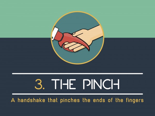
For example, small, but creative adjustments were made to these otherwise consistent slides to draw attention to the area of emphasis – the handshake.
Cut The Chatter
In addition to updating the visuals, with Mr. Marr’s permission we also revised the content on the slides. While the information on each slide was interesting, the length was better suited for a blog post, a book, or an article.
Presentations are meant to be clicked through; they are not substitutions for books or other lengthy content pieces. Presentations should be energizing and lightweight in regards to content.
If you deliver your presentation on stage, in front of an audience, quickly clicking through highly-visual slides will help you hold the attention of audience members. With fewer words on the slides, you will remain the star of the show, and your slides will be your perfect sidekick.
Online presentations uploaded to Slideshare or other sites typically require slightly more content since there is not a speaker actively presenting the slides. However, the content should still be as minimal as possible for online presentations. Don’t make your viewers click through slides that each display a hefty workload in the form of dense paragraphs. Instead, transform your slides into bite size pieces of information. Your audience will appreciate your focus and brevity.
Conclusion
Don’t let ineffective slides damage your professional credibility. Give old presentations a facelift by revising your visuals and refining your content.
Additional Resources
Have Fun With Your Presentation Design. Here’s How.
7 Great Presentation Design Resources