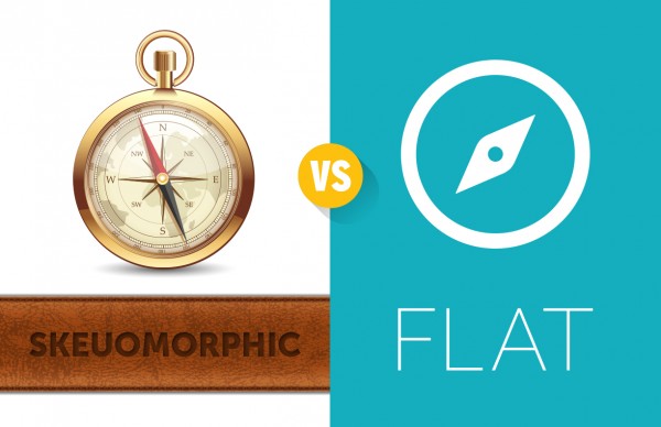
Presentation design is complex. Every presentation is completely different from all other presentations. The audiences are different, the venues are different, and the topics are different. As a result, the visual direction for every presentation is different. Design elements need to be carefully selected to fit the specific characteristics of each presentation. Some presentations benefit from slides designed with photography and typography elements, while other presentations require illustrations with a lot of detail.
If, however, your presentations will primarily be shared digitally, you are in luck. Your presentation design decisions can be somewhat simplified. If you do not have a strong reason to select one presentation style over the others, use flat designs for your presentations that will be shared online. Here’s why:
1. It is fast.
If you are sharing a HTML5 presentation, or delivering your presentation via email, load time is a critical factor in your presentation’s success. The image size and color depth of your designs will impact your load time. Photos and realistic (skeuomorphic) graphics typically contain hundreds to millions of colors. This large amount of color bulks up the image’s file size, thus slowing down a page as it loads. Flat, one, two or three color graphics load much faster due to their small file size, which is due to their low number of colors.

Lesson: Flat design will keep your file sizes small.
2. It is simple.
With so many distractions on the Internet, your presentation needs to be simple to understand so that your message can be quickly absorbed.
Flat design is based on simplicity and directness. The best flat design tells you what you want to know, as simply and directly as possible. In contrast, skeuomorphic design generally contains many unnecessary decorative elements. Take the “bathroom man and woman” for example. They’re iconic and used globally because of their simplicity and directness. This is the same concept used in flat design.
Lesson: Flat design simplifies visual communication.
3. It is modern.
Skeuomorphic design is slowly dying out for many online platforms. The reason? The Retina display.
Skeuomorphic designs rely heavily on drop shadows, glares, shines, and textures. These were used, in a large part to cover up the lack of clarity or resolution of earlier screen models. For example, a soft drop shadow can mask a hard edge that appears blurry or pixelated on non-Retina screens. Retina displays provide a crisp, almost print-quality visual; a sharp edge looks like a sharp edge. There is no need to use the cover-up tricks of skeuomorphic design.
Lesson: Flat design is a great match for Retina displays.
Conclusion: Flat design is not the best style for every presentation. However, if you are struggling to choose a creative direction for your slides, and your presentation will be shared online, there are at least three reasons why flat design might be the right solution for you.
