“Colors speak all languages.” – Joseph Addison
In 1706, Sir Isaac Newton created the first color wheel; a rotating disk with arrangements of complimenting colors that, when spun, appeared to be white. While he wasn’t the first to explore the relationship of colors, the color wheel inspired others to create tablets, charts, and graphs in an attempt to better understand “color theory.”
Color theory is an enormous study that covers ideas, psychology, design application, and even color mixing formulas. For the presentation designer starting with a blank slate, this article can help you better understand the basics of why color theory is effective, what works, and what doesn’t. Because no one should have to stare at an empty slide for hours, crying with indecision.
Why It Matters
Color is a powerful visual communication tool. It’s why companies spend dump trucks of money developing the perfect shade for their to-go cups and why 75% of pencils sold in the U.S are painted yellow. Colors evoke feelings, associations, and experiences. A recent study called the “Impact of Color in Marketing” discovered that 90% of quick judgments made about purchase can be based on color alone.
Research into the subject can be also be incredibly difficult, as many color associations are culturally based. Consider the color pink, for instance. In a publication from the Earnshaw’s Infant Department in 1918: “The generally accepted rule is pink for the boys, and blue for the girls. The reason is that pink, being a more decided and stronger color, is more suitable for the boy, while blue, which is more delicate and dainty, is prettier for the girl.” It would be difficult to find a man today who could say with certainty that pink is “decided and stronger,” when marketing dictates that everything from underwear to pens marketed to women have that hue.
It’s important to keep a pulse on these trends, no matter how drastically they shift. Red and green evoke Christmas, black and orange conjure Halloween; nearly every color has a cultural association that could influence the way your presentation design is received. Brands rely on our existing associations to present themselves as “trustworthy gray” or “exciting red.” It’s a meaningful way to wordlessly add value to your presentation’s message, and you should be constantly asking yourself: what do my color choices evoke?
Color Wheel
“I advise students on the subject of color as follows: If it looks good enough to eat, use it.” – Abe Ajay
Learning the color wheel is an excellent place to start understanding color relationships. With some variation in organization, the color wheel was developed to show how hues relate to each other. There are three “levels” of complexity in a wheel:
Primary – Red, yellow, and blue. In traditional theory, all colors can be derived from these three shades. They also can’t be created by mixing any other colors, and therefore form the basis for all of the “wheels.”
Secondary – Green, orange, and purple/violet in addition to the primary colors The reason behind this? They can be created by mixing the original primary colors.
Tertiary – Yellow/orange, red/orange, red/purple, blue/purple, blue/green, and yellow/green are all included with the primary and secondary colors. Again, this includes basically any color that can be created by mixing primary and secondary hues. From here, the wheel is open to anything.
The way the colors are organized also corresponds to the color’s wavelength of light; which is essentially how our eyes differentiate shades. Why does the wheel matter? Understanding these relationships forms a basis for useage theory. For example, some will use the wheel to pull two colors from opposite sides to create a “complementary” theme; a quick glance at a wheel can decode these choices. Here are three different examples of ways to use the color wheel to pick a scheme for your presentation:
Complementary Colors – Choose a color you like on the wheel, and then draw a straight line directly across the circle. The opposite color is known as the “complementary” shade, and can be used to complete your main color without being competitive.
Analogous Colors – This is accomplished by selecting a color on the wheel and then also choosing the color(s) beside it. It helps to avoid matching the same shade, and helps if you want to add a more subtle highlight. Think of yellow/orange or red/violet, for instance.
Triad Colors – First, select one color on the wheel. Then, draw an equilateral triangle to uncover the other two shades. These colors are thought to compliment one another, but have a little more complexity than just picking two.
There are certainly other ways to discover color combinations on the wheel, but above all, start by selecting a shade that evokes meaning for you.
Color Harmony
So, you understand the color wheel and a few ways to select complementary shades, but you might be wondering where these rules emerge. Why do some colors work together when others horrify?
“Combinations of colors that exist in harmony are pleasing to the eye. The human brain distinguishes the visual interest and the sense of order created by the harmony and forms a dynamic equilibrium.” – Kate Smith, “Sensational Color”
Aside from utilizing color wheel suggestions, you might also look to nature for some inspiration of “what colors work.” Flowers, sunsets, and even birds offer an array of colors that were made to be together. Consider a peacock palette for your next presentation, or the beautiful tones of a butterfly. Creating a mood board with images like this can also help inspire you. Not sure what a mood board is or where to begin? We’ve created a complete guide to getting started.
A good strategy for selecting harmonious presentation colors is to choose three that represent a Background, Base, and Accent Color. The background and base should be colors in a similar range of the color wheel, while the accent color should represent a shade furthest away from the background and base.
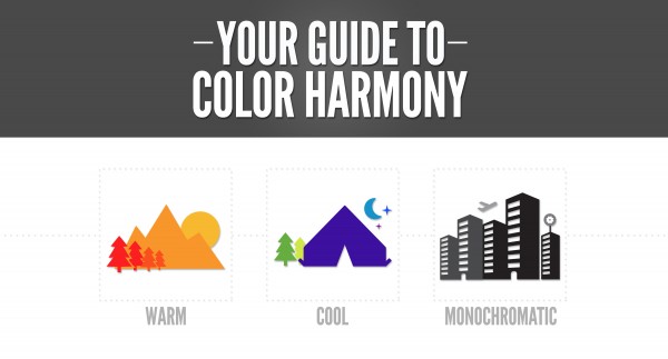
How about a harmonious theme? You may have heard “warm,” “cool,” and “monochromatic” used to describe sets of colors, so here is a brief rundown about what each of those means:
Warm Colors: Reds, oranges, and yellows. This is a bright, vibrant set that conveys energy and excitement. Think of things that incorporate these colors such as sunshine, roses, sunflowers, bright sunsets, and fruit.
Cool Colors: Greens, blues, and purples. This set evokes tranquility, nature, and is believed to have a calming effect. Think of forests, rivers, lavender, and night sky shades.
Monochromatic Colors: Black, white, and grey. A perfect theme to pull background and base colors from because these shades evoke simplicity, sophistication, and purity.
Advice For Presenters
“It doesn’t matter whether the overall feeling of the color in a painting is warm or cool, it just shouldn’t try to be both.” – Marion Boddy-Evans
Simplicity is our motto at Ethos3, whether in content or design. Aim for only 3-4 color choices throughout your deck to start with, ensuring that you are happy with your background, base, and accent color. The word to keep in mind is “harmony.” Don’t let your colors compete for brightness, ensure all of your text is readable, and visually edit your presentation by searching for colors that evoke any unwanted themes. We also have some great resources on the Ethos3 blog if you want more information about what works and what doesn’t.
Using the color wheel also can help you limit yourself from choosing too many hues and “cluttering” the presentation with color. If you have an accent color, let that accent color be the loudest “voice” in the presentation.
Not sure if your colors are going to look terrible together? There is a great website that lets you adjust up to four colors to see how they look next to each other called Adobe Kuler. The website is free to use and highly addictive. You can also select from a drop-down box one of the color wheel rules mentioned in this article. Before you begin to design your first draft, this resource allows you to “preview” what the presentation will look like.
It’s important to note that color theory is personal for each viewer. The same shade of fire-engine red might remind you of apples and another person of the time they broke their ankle and rode in an ambulance. If you’re worried that your colors are overwhelming or will scare the audience, reduce the number of colors you are using and throw in a monochromatic shade in the place of a brighter one. All you really have to do is select colors in the same family, refer to a wheel as needed, edit for the feeling it evokes, and make it simple. We believe in you.


