What are the first words that come to mind when someone says “data”? Probably something along the lines of ‘boring’, ‘tedious’ and ‘complicated’. There’s little chance ‘exciting’ or ‘engaging’ came to mind. Data and statistics have something of a bad rap, and understandably so. If they aren’t used in a creative and engaging way, they can easily be the death knell of a presentation. The line between a presentation that can change the world, and one that’s classic Death by PowerPoint is surprisingly fine, and your use of data can be a make or break moment.
Below are several slides from a recent presentation in which we worked on both content and design, and all of them serve as great examples of how to make data compelling in a presentation.
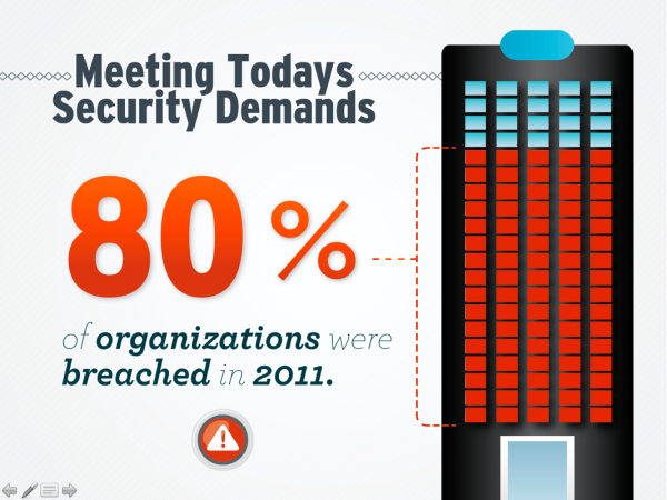
Immediately after glancing at this slide, the audience knows what fact is the most important on it, and that’s the number: 80%. Our designer made sure to emphasize the importance of the 80% by making it the largest element on the slide. And the meaning is further hammered home by the accompanying graphic, which is simply a visual rendering of the information.
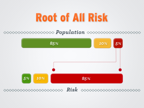
The message here is that “85% of all risk comes from 5% of the population.” Rather than simply stick that sentence on the slide, our designer reworked the data point in a visual way, which is more engaging and rememberable for the audience.
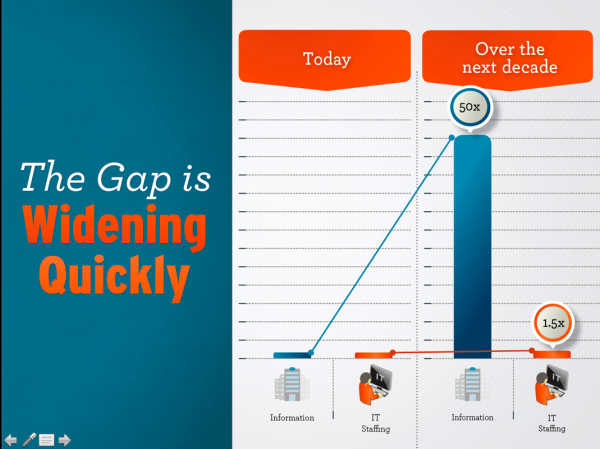
The message point here is: “Over the next decade…
- the number of servers (virtual and physical) worldwide will grow by a factor of 10
- the amount of information managed by enterprise datacenters will grow by a factor of 50
- the number of files the datacenter will have to deal with will grow by a factor of 75, at least.
- Meanwhile, the number of IT professionals in the world will grow by less than a factor of 1.5.”
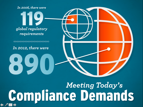
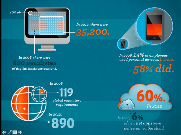
Let’s take a look at these two slides together. Which one leaves more of an impact on you? Which of the two is more memorable? In which is the main point of the slide 100% clear from first glance? Hopefully, you answered these questions with ‘the first slide.’ As you can see, the first slide is simply a larger version of one of the four data points in the second slide. There’s so much information packed onto the second slide. There’s no indication as to what’s most important information, and there’s no single focus.
We always encourage our clients to break up data points onto different slides, with one point on each slide, as seen in the first slide. That way the audience knows exactly what point to focus on, and they won’t be distracted by other information while you speak.
