The following slides are from a Before & After PDF we send to our clients before we begin a project, so we can get an idea about look & feel, and we can give them some idea of our mission here at Ethos3. This particular deck is one that we redesigned for the company goFluent years ago. Let’s go through them one-by-one and point out a quick lesson we can learn from each set.
BEFORE
AFTER
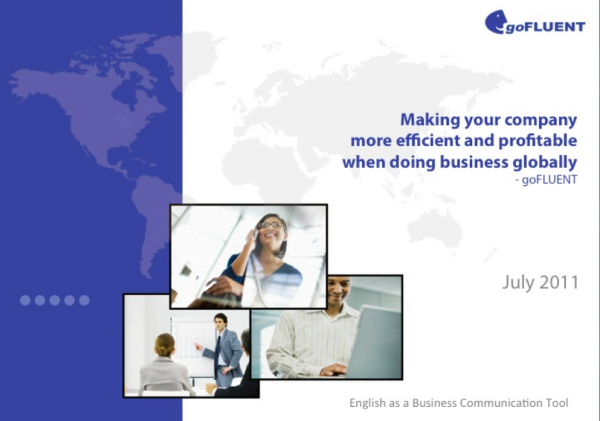
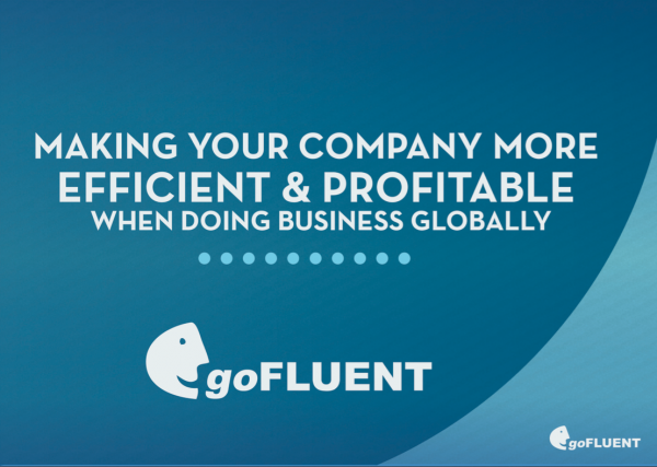
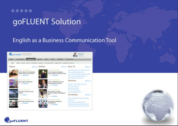
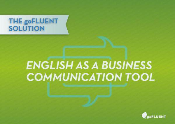
Quick Tip #1: In the Before slide, it’s not immediately clear what the most important information is on the slide. The eye is drawn to the photos (which are small and stocky) instead of to the most important information, which is goFluent’s mission. In the After slide, goFluent’s mission is the largest element on the slide, so the audience immediately knows it’s important, and the varying cases keep the text visually interesting.
BEFORE
AFTER
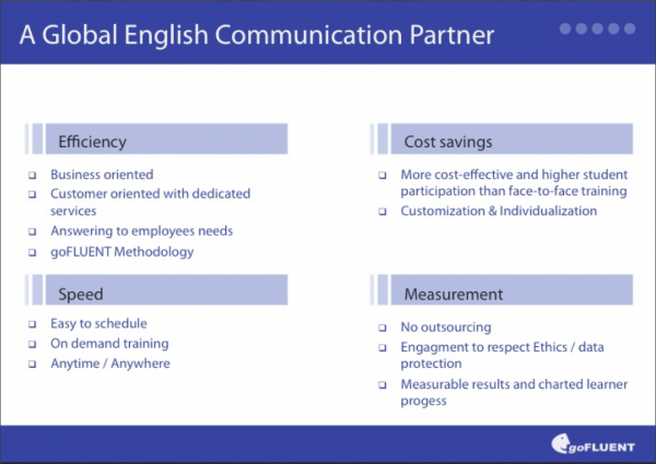
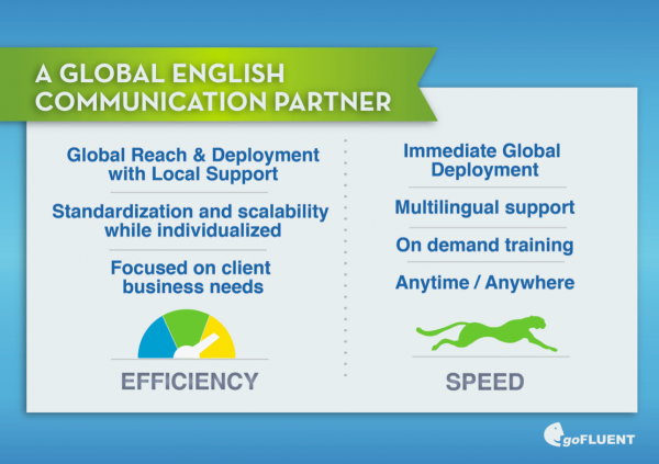
Quick Tip #2: This Before slide is a typical Death by PowerPoint slide, riddled as it is with ugly bullet points. If you do find yourself in a situation where you want to keep a lot of the text on the slide, don’t think of that as an excuse to use bullet points! Rather, break up the bullets into lists (always sans bullets), like in the After slide, and make it more visually interesting by using icons.
BEFORE
AFTER
Quick Tip #3: Avoid using images that don’t leave a significant impact on the viewer. The screenshot in the Before slide doesn’t leave a lasting impression on the audience because it’s much too small and pixelated. Notice how much stronger the After slide is when we pull out the most important information in large text. In the Before slide, we’re not quite sure what’s most crucial on the slide; the After slide leaves no doubt in our minds.
BEFORE
AFTER
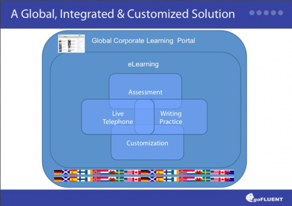
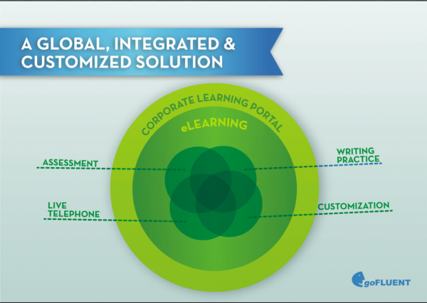
Quick Tip #4: Again, notice the indecipherable screenshot in the Before slide. If an image or a word doesn’t add something of meaning to the slide, take it out. In the case of that screenshot, there’s no way the audience can learn anything from it, so it shouldn’t be included. The double flag banner on the Before slide doesn’t tell the audience anything specific about the company, so it’s also unnecessary. Notice how much cleaner the After slide is compared to the Before slide–– a result of removing all the extraneous clutter.
BEFORE
AFTER
Quick Tip #5: This set of slides is another great example of how large type creates a memorable slide. Again, we have extraneous elements on the Before slide, with the tiny stock photo and the world image. Conversely, the After slide is engaging and makes a single point, which is that goFluent is a trusted partner. When in doubt, remove extraneous elements, and increase type on the most important information on the slide.
