We hear it all the time from clients: “We want to avoid stock photography.” “Nothing cheesy or staged.” “No stock photography.” Stock photography has a bad rap, and with all the Death by PowerPoint decks out there, we can understand why. But eliminating stock photography from your deck entirely is limiting and short sighted. With a dash of creativity and a keen eye for design, stock photography can do wonders to visualize and disseminate your presentation’s message.
Below are five slides from a presentation we designed for Jon Acuff, bestselling author of Quitter and Stuff Christians Like. He wanted a very smart, witty deck for his Quitter conference, and our designer delivered just that by using stock photography very creatively.
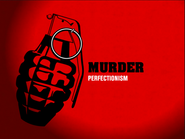
When people think “stock photography,” a perfectly exposed, highly saturated photo typically comes to mind. Don’t limit yourself to that narrow definition. The grenade above is a stock illustration, and it gets the slide’s point across masterfully. Play around with opacities and gradients to nuance the photo and background.

The easiest way to avoid cheesy, phony photos is to keep business people out of it. Start thinking outside the box. How can you say what you want to say without a using a photo of smiling businesspeople? Instead of using generic photos of people on this slide, our designer thought outside the box and used skeletons of people. The same idea is disseminated but in a much more creative way.

A good place to start is by brainstorming metaphors that appropriately describe the concept you’re discussing. In the above slide, for example, the message is “Start Somewhere.” What images, words and ideas come to your mind when you think of that phrase? Our designer used a blank road sign, which perfectly conveys the point in a single image.

Consider using a common color tinting or photo effect to unify all the slides in the deck, and think about integrating type into the photo (like in the above slide) so it doesn’t look like it was just pasted on top of the photo.

Finally, the way you angle and crop a stock photo adds a lot of power to the image. The above image is obviously stock, but the interesting way that it’s cropped (just showing the legs) makes it work. Also, notice how the designer incorporated the ‘patience’ text into the photo by reflecting it on the water.
Subtle nuances like these make stock photography compelling and visually appealing. Don’t automatically rule out stock photography from your presentation. There’s a lot of potential hiding in those happy, shiny images.