Last week we discussed the particular distaste people have for stock photography, including a case study that showed different ways to change that photography into something that doesn’t scream ‘stock’. We’ll continue that discussion today with a presentation design 101 lesson on how to use photo treatments. Use this Photoshop technique to bring consistency to the photos in your deck, as well as to downplay the stockiness of the photos you choose.
BEFORE TREATMENT

These are your typical stock photos, the kind everyone tries desperately to avoid. There’s no consistency between the photos, so avoid just sticking them on slides and moving on. We can easily bring uniformity to these photos with simple photo treatments.
THE PROCESS
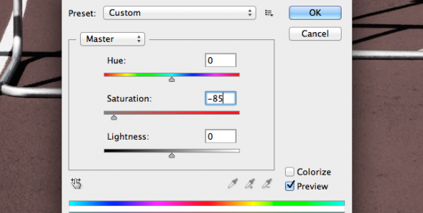 After opening your photo in Photoshop, duplicate it and then adjust duplicated layer’s saturation levels. Bring the saturation level down to something like -85, or simply change the top layer to black and white. This allows you to isolate and emphasize certain colors in the original photo.
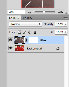 Next, add a vector mask to the duplicated (now black and white) layer. This allows you the most freedom as the mask makes the duplicated slide non-destructive, meaning you can delete the mask altogether (leaving you with your original photo) or you can paint over your changes with white reverting it back to the original look.
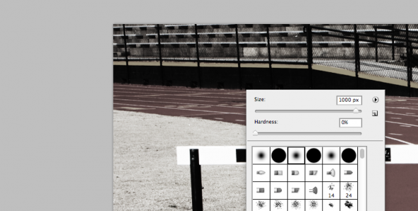
Now you’re ready to start painting on your top layer to reveal the colors underneath. (Make sure you select the mask before you paint.) First, set your brush color to black (black fully reveals the color underneath, grey reveals it halfway & white reverses what black reveals). We recommend changing the hardness of your brush to 0%, as that allows it to feather out (100% has a strictly defined edge). Also, it’s smart to adjust the flow (how much ink flows out of the brush) to 15 as that gives you a lot of control over what is being revealed. After those couple adjustments, start painting the areas where you want the color to show through. Every click of the brush reveals the color beneath more clearly, so be careful to click as little or as much as you desire.
If you’re looking for the highest consistency possible between photos, try using the gradient tool instead of the brush for your photo treatment. The gradient tool draws a precise angle on the photo, which feathers out the color from there. This is a neat trick for generating a more uniform look throughout your deck.
AFTER TREATMENT
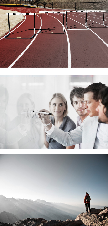
Notice how these photos look much more similar to one another now, thanks to the photo treatment. They also look significantly less stocky than they did in their original form. You can be super creative with photo treatments. Use a gradient with each, or highlight a similar color tone in each photo. This simple presentation design trick greatly enhances the uniformity and reality of stock photography.