Think of all the icons you come into contact with on a daily basis. A cigarette with a line through it: No Smoking. A magnifying glass: Search. A box with people inside, up and down arrows on the outside: Elevator.
Iconography is simply universal communication without words. Icons should be understandable across all languages, and they should be intuitive. As one of our designers sagely puts it: “If you have to think about it, it’s not working.”
Though icons can be complex, simplicity is key (as always in presentation design). When creating an icon or choosing an icon from a library, think of the most universally recognized way to represent the concept. For example, if you’re looking for something to represent construction, nails or a hammer would be appropriate.
Basic word association is a great way to brainstorm potential icons for a concept. Construction = hammer, nails, screwdriver, boards, etc. Marriage = ring, union, proposal, man & woman, etc. Exercise = running, lifting weights, push-ups, etc.
Below are several slides we designed for a presentation given by Commerce Ventures, a venture capitalist firm. The deck utilized iconography heavily throughout. Notice how the icons immediately summon a particular concept to your mind. Remember, the quicker the audience understands the icon, the better.

Here’s the title slide of the presentation. Though there’s no substantial information on the slide, the five icons give the audience an idea of what the presenter will be talking about in the presentation.
Each of the icons above communicates the words below them harmoniously. ‘Average $1 million investment’ would naturally be associated with a check, ‘investors and advisors’ is effectively represented by a handshake, and so on.
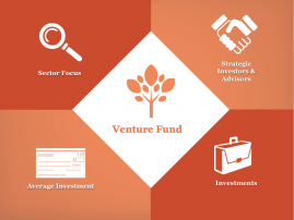
Also, don’t overlook the connotations associated with your icons. A venture fund, for example, is a complex concept and our designer chose to represent it with a tree because a tree is something that grows (as hopefully this venture fund would) and a tree is something that needs to be nurtured (which is precisely what the presenter would do with the investor’s money).
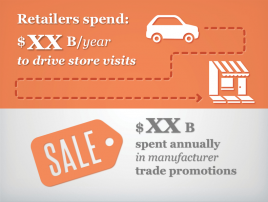
This slide is a great example of how simple it can be to visualize concepts with icons. The top half of the slide depicts the amount of money spent on driving to visit a store, so naturally, the icons used are a car and a store. And the bottom half of the slide is discussing the amount spent on promotions, which naturally brings to mind the word ‘Sale’.
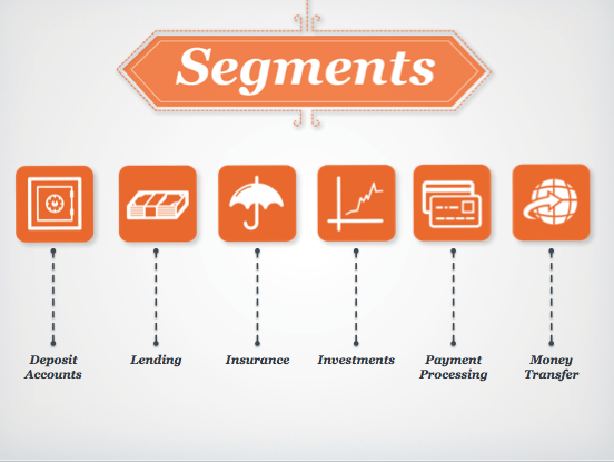
Again, note how simple the icons are on this slide. Their simplicity lends power to the slide. They are beautiful, to be sure, and they’re also entirely communicative. They represent the concepts associated with them, and they do so effortlessly.