We categorize our lives based on a myriad of things, but one of the more beautiful things that organize our lives is color. Our eyes, hair and skin are all a certain color that reveals something about us to others. We choose our clothes carefully based on color. We all have a favorite color. Colors mean a lot to us– on a personal as well as professional level. Here are a few design 101 tips on using color in presentations.
Color Theory
There’s a multitude of ways to organize color, including analogous colors (any three colors that are side by side on a 12-part color wheel) and complementary colors (any two colors that are directly opposite each other on the wheel). However, the most common way to organize color is between warm colors and cool colors.


Warm Colors – Reds, oranges and yellows. Red is a great accent color that signifies love, importance and passion (Note the use of red in the above slide, which lends importance to the question). Orange communicates characteristics such as vibrancy, energy, health and change. It tends to be more inviting than red (Note the use of orange in the above slide, which encourages the viewer to trust in the energy and vibrancy of the market). Yellow is obviously the brightest of the three warm colors, representing sunshine, happiness and hope.


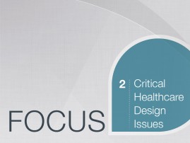

Cool Colors – Greens, blues and purples. Green connotes growth and nature, and signifies a down-to-earth, stable mood. Blue is the most typical color to represent sadness, but it also signifies calm, responsibility, strength and reliability. Purple has long signified royalty, and lighter shades of the color signify wealth and luxury while darker shades represent spring and romance. Notice the use of cool colors in the slides above, which lend them a relaxed, responsible feel, which is ideal for the client, an architecture firm that was looking to move into the hospital space.


Monochromatic – The use of classic black and white is supremely important in presentation design, as they serve as excellent backdrops when combined with bright accent colors. Black signifies power, elegance, formality and sophistication, while white expresses purity, virtue, cleanliness, simplicity and goodness. White is popular in minimalist design and is an excellent color to use to create space in design. Note how the use of white in the above deck makes the text pop off the slide, and notice how the use of a black background strengthens the point the slide makes by emphasizing power and strength. Also, notice here how red is used as an accent color.
Mood
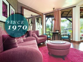


What mood do the slides above put you in? How do you feel looking at them? Do you feel happy? Calm? Don’t forget that the color scheme of your presentation encourages your audience to feel a certain way. Use this to your advantage. Help your audience feel what you want them to feel. These slides in particular invite the audience to feel relaxed, retro and timeless, which is precisely what one would like to feel when on vacation, staying in a beautiful hotel.
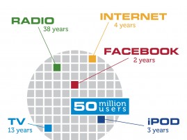


How about these slides? How do they make you feel? The colors evoke a mood much different than the previous ones, right? The use of primary colors and lots of white space lends them a professional, techy feel. Overall, it’s a clean, expert design.
How can you use color in your next presentation to reveal something about your content? What mood do you want your audience to be in? How do you want them to feel? Use colors to achieve it.